Buscador

lunes, 5 de octubre de 2020

Seminario Permanente sobre Discapacidad PUDH-FCPyS UNAM

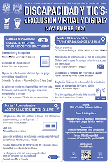
 El próximo 17 de noviembre de 2020 participaré en el Seminario Permanente sobre Discapacidad PUDH-FCPyS UNAM Discapacidad y TIC's: ¿Exclusión virtual y digital? organizado por la Universidad Nacional Autónoma de México. Este seminario comienza el 3 de noviembre.

Cartel de promoción del evento

Más información en la página de Facebook.


viernes, 2 de octubre de 2020

Cuidado con las herramientas automáticas de revisión de la accesibilidad web

En Use Caution with Automated Tools that Promise 100% Accessibility Compliance se explica:
Automated accessibility testing tools, powered by artificial intelligence (AI) and code-scanning technology, can be an important part of an accessibility testing plan — but, they must remain just a part. Automated testing on its own should not replace manual testing by an accessibility expert and should not be used as the only way to show compliance.
Y avisa del peligro del texto alternativo generado de forma automática mediante inteligencia artificial:
As technology advances, there are even image-recognition programs that can with some accuracy guess what an image depicts and generate alt text. On one hand, it's incredible that this technology exists. On the other, it presents an additional layer of review required by human beings. The real purpose of an image in the context of a web page, the real feeling somebody is supposed to be exposed to, the real information conveyed by an image can't be decided by a machine — at least not yet.

miércoles, 23 de septiembre de 2020

Experiencia equivalente

Muy interesantes, llenos de ejemplos, los artículos Equivalent Experiences: What Are They?Equivalent Experiences: Thinking Equivalently publicados en Smashing Magazine.

El resumen dice:
An equivalent experience is one that has been deliberately conceived of and built to be able to be used by the widest possible range of people. To create an equivalent experience, you must understand all the different ways people interact with technology, as well as common barriers they experience. 
Constructing an equivalent experience may mean changing the way you think about development and design, and potentially reevaluating your existing work. In this article, we’ll address common accessibility issues, and how to best go about improving them so everyone can effortlessly access your content.

viernes, 18 de septiembre de 2020

¿Qué son las características accesibles de un sitio web?

En What Are Accessibility Features of a Website? explican qué son las características accesibles que ofrecen algunos sitios web:
Website accessibility features are the elements of a site designed to improve the ability of people with disabilities to independently use it. Sometimes websites include extra options specifically to enhance some people's use, but usually accessibility features are integrated into a well-coded website that is accessible by default.
Aunque normalmente estas características que se añaden con muy buenas intenciones, a veces pueden causar problemas a ciertos usuarios:
Sometimes, extra accessibility features are added with the best of intentions, but in practice can actually cause new problems. For example, some websites or digital tools will include their own screen reading technology with the goal of providing easy access to people who are blind, have low vision, or otherwise benefit from hearing content instead of or in addition to seeing it. However, many people who need to use screen readers already use one and likely have a go-to screen reader they prefer for that particular type of content, web browser, or device. In this example, the extra screen reader might interfere with the native screen reader, or vice versa, and accessibility will have been compromised, not improved.
Another common example are keyboard shortcuts. Some websites will offer custom keystroke combinations designed to save the user time or make interaction easier, and sometimes these can be helpful. Other times, however, keyboard shortcuts might interfere with screen reader or other assistive technology commands, or with keyboard shortcuts that users who need them most already have programmed. Again, in this example, something intended to improve accessibility can make the website unusable if not done carefully.

miércoles, 16 de septiembre de 2020

Los enlaces "saltar a" son importantes

Muy interesante la explicación y el código que se ofrece en Skip links are important:
"Skip links" are important. They allow keyboard-only users, sighted or not, to bypass large or repetitive blocks of content. You may have heard of them and wondered what the big deal is. Or your design team may have refused to implement one because they look “ugly”. But they are important, and they don’t have to break the design. 
Lots of links
Many sites have a lot of links at the top of the page. The mega menu isn’t dead! It seems like news websites are particularly bad with this. The Montreal Gazette has over 175 links before reaching the main content. CNN does better, with only 19 links. The Austin Statesman “only” has 18 or so, but the very first link isn’t keyboard-friendly, and it’s the “navigation menu”. The navigation menu has nearly 60 links! Perhaps it’s just as well it’s not keyboard accessible? Stuff has a couple dozen links (and no focus visible - but that’s a story for another day).
All these links before the main content mean that a keyboard-only user has to tab through every single link before they can reach or interact with the main content. This is not a great experience.
Screen reader users are keyboard-only users. Their assistive technology allows them to navigate to different areas of a page, by using landmarks or headings, for example (if they’ve been implemented on the site). But sighted keyboard-only users don’t have that luxury, because browsers don’t (yet?) allow this kind of navigation.
Not just top content
Another area of concern can be social media embeds, such as Twitter feeds. These may have as many as 200 links to tab through before being able to get to the other content. 
Compliance
It’s important to make your visitor’s life easier by allowing them to bypass blocks of links. But it’s not just about making their life easier. It’s also about compliance. WCAG success criteria 2.4.1 Bypass Blocks requires this. I generally don’t like to push accessibility from a compliance perspective. But it’s important to note that factor.
En el artículo se ofrece el código para implementar correctamente los "skip links".

lunes, 14 de septiembre de 2020

Accesibilidad en Android

Para los usuarios ciegos o con baja visión:
Para los usuarios con problemas de movilidad:

Para los usuarios sordos o con problemas de audición:
Para los usuarios con problemas cognitivos o de aprendizaje:

viernes, 11 de septiembre de 2020

16 cosas que se pueden hacer para mejorar la accesibilidad de un sitio web

16 Things to Improve Your Website Accessibility está escrito por Bruce Lawson, un gurú de la accesibilidad web.

Las 16 cosas que propone son:

1) Too Much Content
In brief: break up text into sections with headings and bulleted lists. Use simple language.

2) ReCAPTCHA
In brief: don’t make your users jump through potentially impossible hoops in order to save developer time.

3) Poor Legibility
In brief: make sure text has adequate contrast, is readable and isn’t justified.

4) Distracting Images and Graphics
In brief: allow users to stop any movement; respect their operating system settings; don’t auto-play video.

5) Poor Link Information
In brief: make links identifiable, with unique link text. Warn users if a link will open a new tab or a file.

6) Another Design Error: Removing the Focus Ring
In brief: make sure a keyboard user can always see where they are currently focused.

7) Form Filling
In brief: design form fields that look like form fields, each associated with a label. Don’t disable auto-fill.

8) Provide Text Alternatives for All Images, Video, and Audio
In brief: any information communicated through an image or video must have a textual equivalent.

9) Add Proper Document Language
In brief: let assistive technology know the language that your text is in.

10) Help a Visitor Get Around Your Content
In brief: use HTML landmark elements to help assistive technology users understand and navigate your content.

11) Use HTML Properly
In brief: understand the semantics and default behaviors of HTML elements; use the right element for your content.

12) Complex Interactions
In brief: Use ARIA only when a native semantic doesn’t exist; use the design patterns and code suggested by W3C.

13) Frameworks
In brief: frameworks aren’t inherently inaccessible if you choose your components wisely.

14) Content Management Systems and Site Builders
In brief: choose CMS and Site Builder themes carefully.

15) PDF
In brief: PDFs can be made accessible. Make sure your PDFs are so.

16) Keep Testing
In brief: test! With real people, if you can.
miércoles, 9 de septiembre de 2020

El atributo placeholder no es una etiqueta, no sustituye a label

Just so we’re all clear on this, the HTML5 placeholder attribute in a text input is not a replacement for the label element. Period. The placeholder should only be used as a brief example of the text to be entered. 
Besides inconsistent support for screen readers, using a placeholder as an input label can create usability problems and issues for those with cognitive impairments. For example, how does one review the information entered if the placeholder is now gone? 
The placeholder should be used like a title attribute (tooltip); it provides only supplementary information. If the information is required for the user (such as a strict text format) then this should be conveyed in the main content of the page, not in an attribute.

lunes, 7 de septiembre de 2020

Pautas de diseño para personas mayores

En 4 Tips for Designing Apps for Older Users se dan estos cuatro consejos:
  1. Haz el texto fácil de leer
  2. Agranda el tamaño de los elementos interactivos
  3. Divide las tareas y haz una cosa cada vez
  4. Mantén los textos claros y simples

viernes, 4 de septiembre de 2020

Novedades de WCAG 2.2

 El 11 de agosto de 2020 se publicó una nueva versión de WCAG 2.2. Todavía sigue siendo "working draft", pero el documento ha avanzado bastante respecto la versión anterior. Las principales diferencias respecto a WCAG 2.1 son nueve nuevos criterios de éxito:

  • Accessible Authentication
  • Dragging
  • Findable Help
  • Fixed Reference Points
  • Focus Appearance (Minimum)
  • Focus Appearance (Enhanced)
  • Hidden Controls
  • Pointer Target Spacing
  • Redundant Entry

viernes, 28 de agosto de 2020

Herramienta para evaluar la accesibilidad de las herramientas de autor

El W3C ha creado ATAG Report Took, que guía al usuario en la evaluación de la accesibilidad de las herramientas de autor.

lunes, 24 de agosto de 2020

Consejos para mejorar la accesibilidad para las personas con discapacidad cognitiva

En Designing for cognitive accessibility: Where to begin se ofrecen interesantes consejos para mejorar la accesibilidad para las personas con discapacidad cognitiva:

There are many techniques that can be used to enhance attention, including:

  • Pausable website carousels – these are multiple pieces of content which rotate across a single coveted space on a webpage. Carousels that are automatically moving content need the ability to be stopped once a particular image captures a visitor’s attention.
  • Restart capabilities – they allow users to save their data and their place in forms and multi-step transactions, like ecommerce. This makes it easier for sites to regain customers’ attention in the event of a distraction.
  • Retracing capabilities – this is a “go back” option which enables site visitors to easily return to recognizable points in their transaction or journey, so they can seamlessly pick up where they left off before becoming distracted. For example, a student in an online learning module needs to be able to go back and rewatch, reread, and rethink about a lesson as many times as necessary.
  • Filtering – the ability to hide non-related content and later unhide it. For example, in an online learning platform, students should have the ability to turn off the chat feature while they are focused on a learning module (and then turn the chat back on when they are finished).
Y también:

  • User authentication – offer at least one alternative method that does not rely on a user to memorize character strings. These include options such as biometric methods (ex. fingertip sensor). In addition, don’t block copy/paste functionality from password manager software.
  • Don’t hide important/frequent controls; also, show both the text and icon labels for controls making it easier for users to remember their purpose.
  • Grouping content – In ecommerce, group similar items semantically and visually with a suggested maximum group size of five. This reduces reliance on memory when evaluating and making choices between similar items.
  • Path markers – to remind site visitors where they are in a process.

miércoles, 19 de agosto de 2020

Aprender los atajos de teclado de los lectores de pantalla

En Learning common keyboard shortcuts for screen readers se explican algunas técnicas para aprender los atajos de teclado de los lectores de pantalla más populares.

lunes, 17 de agosto de 2020

Las cinco reglas de ARIA

En Using ARIA:

  1. First Rule of ARIA: If you can use a native HTML element or attribute with the semantics and behavior you require already built in, instead of re-purposing an element and adding an ARIA role, state or property to make it accessible, then do so.
  2. Second Rule of ARIA Use: Do not change native semantics, unless you really have to.
  3. Third Rule of ARIA Use: All interactive ARIA controls must be usable with the keyboard.
  4. Fourth Rule of ARIA Use: Do not use role="presentation" or aria-hidden="true" on a focusable element.
  5. Fifth Rule of ARIA Use: All interactive elements must have an accessible name.

Y en español:

  1. Primera regla de ARIA: si puede usar un elemento o atributo HTML nativo con la semántica y el comportamiento que ya necesita, en lugar de reutilizar un elemento y agregar un rol, estado o propiedad de ARIA para hacerlo accesible, entonces hágalo.
  2. Segunda regla de ARIA: no cambie la semántica nativa, a menos que realmente tenga que hacerlo.
  3. Tercera regla de ARIA: todos los controles interactivos de ARIA deben poder utilizarse con el teclado.
  4. Cuarta regla de ARIA: no use role="presentation" o aria-hidden="true" en un elemento enfocable.
  5. Quinta regla de ARIA: todos los elementos interactivos deben tener un nombre accesible.

viernes, 14 de agosto de 2020

Una excelente crítica de las capas de accesibilidad (accessibility overlay)

Karl Groves, un experto internacional en accesibilidad web, ha escrito What would an ethical overlay look like?:

Accessibility overlays have existed on the market since at least around 2004. Companies such as Readspeaker offered products that displayed a widget on customers’ websites that were best described as “add-on assistive technologies”. The primary feature offered by such products was the ability to read the page content aloud to a website’s users.
The benefit to such a feature would seem obvious to the layperson: If you have problems seeing the page or have problems reading, then a feature that reads the content for you would certainly be a significant improvement.  To people with deep knowledge of the Web and accessibility, the shortcomings of a per-site read-aloud widget are glaring. After all: if a user needs to have the content read-aloud to them on one site, they’ll need it on all websites and all applications they use.  In other words, such software is best deployed on the user’s computer, not on individual websites.
[...]

It is simply impossible to examine the claims made by overlay vendors against what their products actually do and come up with a conclusion that differs from the following: 
Overlay vendors overstate their products’ capabilities. They deceive their customers and, as a result, are actively harming the field of accessibility and doing a severe disservice to end users with disabilities. This, in turn, is a waste of money and delays active improvement to a website. These products will not make your site compliant with the ADA, Section 508, EN 301 549, or any other regulation based on WCAG.

lunes, 10 de agosto de 2020

La importancia de la revisión manual de la accesibilidad web

En The Importance Of Manual Accessibility Testing se analiza la importancia de realizar revisiones manuales de la accesibilidad web y no confiar ciegamente en las herramientas automáticas:
Automation really shines here. It can repeatedly and tirelessly pour over these details with perfect memory, at a rate far faster than any human is capable of.
However…
Automated accessibility tests aren’t a turnkey solution, nor are they a silver bullet. There are some limitations to keep in mind when using them.

viernes, 7 de agosto de 2020

Accesibilidad de los programas de videoconferencia

En Which Video Conferencing Tools Are Most Accessible? han analizado la accesibilidad de los programas de videoconferencia, parece que el mejor es Zoom.

miércoles, 5 de agosto de 2020

accessiBe, la herramienta mágica

accessiBe es una herramienta mágica por todo lo que promete:
accessiBe is transforming web accessibility by replacing a costly, manual process with automated, state-of-the-art AI technology.
Using the contextual understanding and image recognition, acessiBe’s AI scans and analyzes websites to learn what elements and functionality they include, and adjusts them to blind users’ screen-readers.
¿Será verdad?

lunes, 3 de agosto de 2020

Dyslexic.com

Dyslexic.com es un sitio web dedicado a la venta de productos de apoyo para las personas con dislexia.

Tiene una página dedica a los tipos de letra para las personas con dislexia.

viernes, 31 de julio de 2020

CSS para mejorar la legibilidad de los textos

En el artículo Modern CSS Techniques To Improve Legibility de Smashing Magazine explican cómo mejorar la legibilidad de los textos con CSS.