A very very quick selection of decisions that Google and Apple made that were counter to what experienced usability and UX experts recommended:
- Google Material Design told us form fields were better without boxes, until they tested it.
- Apple told us removing button outlines in iOS was better, until users complained.
- Google relies on color alone for links in search results, which is a WCAG violation.
- Apple went with super-thin typefaces in iOS, until finally making them thicker in subsequent releases.
- Google Chrome uses a default blue focus indicator, which is invisible on their own blue-background navigation.
- Apple thought animating apps on launch was cool, until users with vestibular orders got sick.
- Google deploys an update to its browser that can break the web for screen reader users, and lets it sit for for two releases.
- Apple for years has hidden the semantics of lists when they are styled, forcing developers to use hacks to reinsert them.
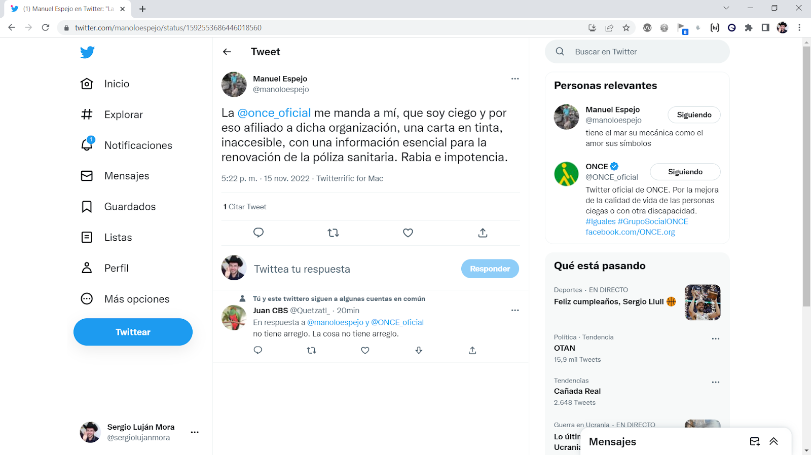
- Google shares lessons learned from its commendable Disability Support team in the form of an inaccessible PDF document that insists it cannot make accessible.
- Apple continues to fail to build VoiceOver support for an HTML element that has existed since the dawn of HTML and 2½ times longer than VoiceOver on iPhone.
- YouTube announces it is removing the ability for community members to contribute subtitles or captions to videos.
- Apple still does not send a focus event when a native button is clicked, an issue first reported in 2009, again in 2012, again in 2013, and yet again in 2013.
- Both Apple and Google are content to let crowd-funding efforts drive the addition of accessibility features (:focus-visible and inert) or CSS feature support (:not()) to their browsers.
- Apple makes a landing page touting its accessibility accomplishments, but the page itself has accessibility issues (not all are false positives, despite response).
- Google has a VPAT for Gmail that does not accurately describe its conformance, easily provable, and frustrating yet another claim of “but Google uses these colors”.
- Definitely do not follow YouTube as a good (or passable) example of how to build and use tabs.
- Google tweets a silent text-heavy video to promote its event for International Day of Persons with Disabilities, which is retweeted by the Google Accessibility account. I call them out, show how to do it accessibly, and Google deletes the tweet without acknowledgment while the Google Accessibility account never speaks of it.
- Google launches Designcember to promote its work on container queries and other technologies, but fails to support the developers and ensure the site is accessible. Which I call out. And for which my free labor is requested to QA fixes.
- Apple claims not once, not twice, but three times to have fixed CSS display property accessibility bugs, finally requiring a change in how Can I Use reports support.
- Google Chrome’s developer outreach site, Web.dev, shared how to build an accessible <tool-tip> custom element. Sadly, if you follow its advice you are guaranteed a SC 1.4.13 WCAG violation. Never mind translation issues, misunderstanding of how <abbr> is exposed, a conflation of accessible name and description, and an enforced inability to select text.
- Apple demonstrates Safari in visionOS by using a WCAG-failing site to show Apple’s bespoke low-contrast focus styles. For good measure, Apple also promotes problematic HTML structures.


