Buscador

miércoles, 3 de julio de 2019

Uso de "persona profiles" para testear la accesibilidad

En Using persona profiles to test accessibility se explica:
In 2017, the Accessibility Team at the Government Digital Service (GDS) created accessibility personas to highlight common barriers faced by people with particular conditions and provide tips on how to design for them. 
These user profiles are used by teams such as user researchers and developers to create services that are accessible to all. For instance, there is a persona for Pawel, a user with Asperger’s and one for Simone, a dyslexic user. 
While personas can be a great tool by themselves, we wanted to let people experience the web as that user. So, we created login profiles for each persona. These login profiles simulate the user’s condition and the tools he or she may be using to help with that condition. 
After testing on different devices, we found that Chromebooks were the most successful device on which to use our accessibility persona logins. We explain why in more detail further down.

lunes, 1 de julio de 2019

La importancia de resaltar el foco

En Focusing on Focus Styles se explica la importancia de resaltar el foco en las páginas web:
Not everyone uses a mouse to browse the internet. If you’re reading this post on a smartphone, this is obvious! What’s also worth pointing out is that there are other forms of input that people use to get things done. With these forms of input comes the need for focus styles. 
People are complicated. We don’t necessarily perform the same behaviors consistently, nor do we always make decisions that make sense from an outsider’s perspective. Sometimes we even do something just to… do something. We get bored easily: tinkering, poking, and prodding things to customize them to better suit our needs, regardless of their original intent. 
People are also mortal. We can get sick and injured. Sometimes both at once. Sometimes it’s for a little while, sometimes it’s permanent. Regardless, it means that sometimes we’re unable to do things we want or need to do in the way we’re used to. 
People also live in the world. Sometimes we’re put into an environment where external factors conspire to prevent us from doing something the way that we’re accustomed to doing it. Ever been stuck at your parents’ house during the holidays and had to use their ancient-yet-still-serviceable desktop computer? It’s like that.

Y se explica el uso de :focus, :focus-within y :focus-visible.

viernes, 28 de junio de 2019

Libro "Web Accessibility - A Foundation for Research"

El libro Web Accessibility - A Foundation for Research se acaba de publicar. El contenido del libro es:

Front Matter
Pages i-xxiii


Understanding Disabilities
Front Matter
Pages 1-1
Visual Disabilities
Armando Barreto, Scott Hollier
Pages 3-17
Physical Disabilities
Shari Trewin
Pages 19-33
Deafness and Hearing Loss
Raja Kushalnagar
Pages 35-47
Cognitive and Learning Disabilities
Lisa Seeman, Clayton Lewis
Pages 49-58
Situationally-Induced Impairments and Disabilities
Jacob O. Wobbrock
Pages 59-92
Ageing and Older Adults
Sri Kurniawan, Andrew Arch, Sean-Ryan Smith
Pages 93-119
Speech and Language
Abi Roper, Stephanie Wilson, Timothy Neate, Jane Marshall
Pages 121-131


Conducting Research
Front Matter
Pages 133-133
Inclusive Writing
Tom Babinszki, Anna Cavender, Michael Gower, Jeffery Hoehl, Darcy Lima, Erich Manser et al.
Pages 135-152
Working With Participants
Christopher Power, Helen Petrie
Pages 153-168
Working with Companies, Charities and Governmental Organisations
Andrew Arch, Lisa Seeman, Sarah Pulis, Glenda Sims
Pages 169-183
End-User Evaluations
Sukru Eraslan, Chris Bailey
Pages 185-210
Reproducible and Sustainable Research Software
Caroline Jay, Robert Haines
Pages 211-221


Society and Standards
Front Matter
Pages 223-223
Standards, Guidelines, and Trends
Shadi Abou-Zahra, Judy Brewer
Pages 225-246
Web Accessibility Policy and Law
Jonathan Lazar
Pages 247-261
Tackling the Inaccessibility of Websites in Postsecondary Education
Jane Seale, Sheryl Burgstahler, Björn Fisseler
Pages 263-279
Policy and Standards on Web Accessibility for Cognitive and Learning Disabilities
Clayton Lewis, Lisa Seeman
Pages 281-299
Inclusion
Cynthia C. Shelly
Pages 301-313


Technical Foundations
Front Matter
Pages 315-315
Assistive Technologies
Hugo Nicolau, Kyle Montague
Pages 317-335
Documents and Publications
Vivienne Conway, Amanda Mace
Pages 337-355
Inclusively Designed Authoring Tools
Jutta Treviranus, Jan Richards, Colin Clark
Pages 357-372
Dynamic Web Content
Renata Pontin de Mattos Fortes, Humberto Lidio Antonelli, Willian Massami Watanabe
Pages 373-395
Scientific Documents
Volker Sorge, Dragan Ahmetovic, Cristian Bernareggi, John Gardner
Pages 397-415
Mathematics and Statistics
Neil Soiffer, Steve Noble
Pages 417-443
Usability, Universal Usability, and Design Patterns
David Sloan, Sarah Horton
Pages 445-460
Multimedia Accessibility
Carlos Duarte, Manuel J. Fonseca
Pages 461-475


Techniques and Tools
Front Matter
Pages 477-477
Tools for Web Accessibility Evaluation
Julio Abascal, Myriam Arrue, Xabier Valencia
Pages 479-503
Automatic Web Accessibility Metrics
Giorgio Brajnik, Markel Vigo
Pages 505-521
Tools and Applications for Cognitive Accessibility
K. Miesenberger, C. Edler, P. Heumader, A. Petz
Pages 523-546
User Interface Adaptation for Accessibility
Sergio Firmenich, Alejandra Garrido, Fabio Paternò, Gustavo Rossi
Pages 547-568
Transcoding
Chieko Asakawa, Hironobu Takagi, Kentarou Fukuda
Pages 569-602
Technologies for Dyslexia
Maria Rauschenberger, Ricardo Baeza–Yates, Luz Rello
Pages 603-627
Alternative Nonvisual Web Browsing Techniques
I. V. Ramakrishnan, Vikas Ashok, Syed Masum Billah
Pages 629-649
Education and STEM on the Web
Barbara Leporini, Marina Buzzi
Pages 651-674


Ubiquitous Web Accessibility
Front Matter
Pages 675-675
Wayfinding
Daisuke Sato, Hironobu Takagi, Chieko Asakawa
Pages 677-700
Wearables
Shaun K. Kane
Pages 701-714
Tangible Interfaces
Mark S. Baldwin, Rushil Khurana, Duncan McIsaac, Yuqian Sun, Tracy Tran, Xiaoyi Zhang et al.
Pages 715-735
Mobile Web
Tiago Guerreiro, Luís Carriço, André Rodrigues
Pages 737-754
Fabrication, 3D Printing, and Making
Amy Hurst
Pages 755-776
Internet of Things: An Opportunity for Advancing Universal Access
Federica Cena, Amon Rapp, Ilaria Torre
Pages 777-790
Futurama
Yeliz Yesilada, Simon Harper
Pages 791-803

Back Matter
Pages 805-807


miércoles, 26 de junio de 2019

La importancia de nombrar las cosas para mejorar la accesibilidad web

En Naming things to improve accessibility se explica:

One thing you can do to improve the accessibility of your work is to always ensure things have accessible names. Unique and useful names, ideally, so that they can be used for navigation. In this post I’ll explain how browsers decide on the names for links, form fields, tables and form groups.

Accessibility Tree
When a user accesses your site, the server will send markup to the browser. This gets turned into trees. We’re probably all familiar with the DOM tree, a live representation of your markup, with all nodes turned into objects that we can read properties of and perform all sorts of functions on.

What many people don’t know, is that there is a second structure that the browser can generate: the accessibility tree. It is based off the DOM tree, and contains all meta information relation related to accessibility: roles, names and properties. Another way to say it: the accessibility tree is how your page gets exposed to assistive technologies.


lunes, 24 de junio de 2019

Reproductor de vídeo que permite seleccionar capítulos

En Building Interactive HTML5 Videos podemos encontrar un reproductor multimedia que permite seleccionar los capítulos del vídeo, para saltar fácilmente entre secciones de un vídeo.

Y en Adding captions and subtitles to HTML5 video se explica cómo gestionar los subtítulos desde JavaScript.

viernes, 21 de junio de 2019

Guía de creación de subtítulos de la BBC

Subtitles are primarily intended to serve viewers with loss of hearing, but they are used by a wide range of people: around 10% of broadcast viewers use subtitles regularly, increasing to 35% for some online content. The majority of these viewers are not hard of hearing. 
This document describes 'closed' subtitles only, also known as 'closed captions'. Typically delivered as a separate file, closed subtitles can be switched off by the user and are not 'burnt in' to the image. 
The Subtitle Guidelines describe best practice for authoring subtitles and provide instructions for making subtitle files for the BBC. This document brings together documents previously published by Ofcom and the BBC and is intended to serve as the basis for all subtitle work across the BBC: prepared and live, online and broadcast, internal and supplied.

martes, 18 de junio de 2019

El papel de los traductores en la inclusión de las personas con discapacidad

La semana pasada asistí a las III Jornadas INCLUTRAD de Accesibilidad, Discapacidad y Traducción, organizadas por la Universidad Pablo de Olavide en Sevilla

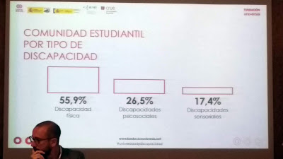
Ramón Rodríguez, director de proyectos globales de la Fundación Universia presentó el IV Estudio Universidad y Discapacidad. Según este estudio, un 1,5% de la población universitaria presenta una discapacidad.


El tipo de discapacidad más frecuente es la física con un 55,9%, seguida de las discapacidades psicosociales con un 26,5% y las discapacidades sensoriales con un 17,4%.


Las jornadas se retransmitieron en directo por Internet. En todo momento hubo interpretación a la lengua de signos española.


También se utilizó el sistema Webcaptioner para ofrecer transcripción en vivo.


Más información:

viernes, 14 de junio de 2019

La primera regla de ARIA

Conviene recordar la primera regla de WAI-ARIA (2.1 First Rule of ARIA Use):
If you can use a native HTML element [HTML51] or attribute with the semantics and behavior you require already built in, instead of re-purposing an element and adding an ARIA role, state or property to make it accessible, then do so. 
Under what circumstances may this not be possible?
  • If the feature is available in HTML [HTML51] but it is not implemented or it is implemented, but accessibility support is not.
  • If the visual design constraints rule out the use of a particular native element, because the element cannot be styled as required.
  • If the feature is not currently available in HTML.

miércoles, 12 de junio de 2019

III Jornadas Inclutrad de Accesibilidad, Discapacidad y Traducción (INCLUTAD 2019)

La Universidad Pablo de Olavide (UPO) de Sevilla organiza las III Jornadas Inclutrad de Accesibilidad, Discapacidad y Traducción (INCLUTAD 2019) los días 13 y 14 de junio de 2019.

El jueves 13, a las 18 horas, impartiré la conferencia "La accesibilidad de los sitios web como recurso fundamental de información y formación".

En EL PRESIDENTE DEL CERMI ANDALUCÍA INTERVIENE ESTE JUEVES EN SEVILLA EN LAS III JORNADAS INCLUTRAD SOBRE ACCESIBILIDAD, DISCAPACIDAD Y TRADUCCIÓN y en Cermi y la Universidad Pablo de Olavide organizan unas jornadas sobre accesibilidad, discapacidad y traducción podemos leer más sobre este evento.


lunes, 10 de junio de 2019

Requisitos de WCAG sobre el contraste y el color

En Understanding WCAG 2 Contrast and Color Requirements, se explican los requisitos de WCAG relacionados con el contraste y el color.

viernes, 7 de junio de 2019

No hay que confiar ciegamente en las herramientas automáticas de evaluación de la accesibilidad web

En Automated Lies, with one line of code se da una buena explicación de los problemas o de las cosas que no hacen las herramientas automáticas de evaluación de la accesibilidad web:
It should be universally understood that automated testing tools cannot offer complete test coverage for all possible accessibility issues on the web. Therefore it stands to reason that if you cannot automatically find all your site’s accessibility issues, you certainly cannot automatically fix all of them, either. This is extraordinarily simple logic. In fact, automatically fixing issues is even less likely to be successful than finding them. This fact is demonstrated within Mallet. While Mallet is extremely good at finding & fixing some issues, it is still limited to around 2-dozen types of ‘fixes’ that work on their own without any configuration. The remainder of Mallet’s fixes require some level of configuration. To put this into perspective, Tenon.io has approximately 200 accessibility tests that look for around 2500 different failure conditions. In other words, we can easily find at least 10x as many issues as we can reliably fix, because fixing the issues requires far more knowledge about the user interface than an automated tool has.
Y también dice:
 As always, it is important to remind the reader that there are limits to what can be discovered with automatic testing. It stands to reason that if you cannot automatically test for something you definitely cannot fix it, either.
  • Captions/ transcripts for audio-only content or audio content in videos.
  • Audio description for video content
  • Content that relies on sensory characteristics to understand
  • Audio control
  • Keyboard trap
  • Pause, Stop, Hide
  • Error prevention and error handling
  • Effective focus management
  • Reading level
The above is only a subset of the many things in web accessibility that cannot be accurately tested via automated means. Many of them are hugely impactful for people with disabilities.

miércoles, 5 de junio de 2019

Cómo construir un sitio web que sea 100% accesible y que realmente no lo sea

En Building the most inaccessible site possible with a perfect Lighthouse score desarrollan un ejercicio muy interesante: cómo crear un sitio web que sea lo más inaccesible posible pero que obtenga una puntuación perfecta en una herramienta automática de evaluación de la accesibilidad.

lunes, 3 de junio de 2019

El símbolo universal de discapacidad

En Does the universal symbol for disability need to be rethought? se explica el origen del símbolo universal de discapacidad y se discute la necesidad de adecuarlo a la sociedad actual:
Ninety-three percent of people with disabilities don’t use a wheelchair, even though the universal symbol that identifies this group is a person in a wheelchair. Liam Riddler, a creative at London’s McCann office, points to his brother, who suffers from Crohn’s disease–a condition that causes inflammation of the digestive tract, potentially causing pain, severe diarrhea, fatigue, weight loss, and malnutrition. It’s an invisible disability: Nobody would know about it by looking at him. Most people don’t understand why he may need to use accessible toilets or take advantage of priority seating.

Public ignorance of these invisible disabilities and the discrimination that results is what prompted Riddler and his colleague–McCann London’s deputy of art Lisa Carrana–to ask an obvious but difficult question: Do we need other symbols for people with invisible disabilities? 
Riddler doesn’t claim to have an answer, but he and Carrana want to spur discussion around the issue with a project they have titled Visability93. Half provocation and half an effort to distill the graphical essence of these disabilities, the project is a crowdsourced competition that asks designers to submit their ideas about how to best graphically represent people with different invisible disabilities using individual symbols. So far they have 29 new icons (which you can download as a typeface here) that range from mental illnesses like anxiety, bipolar disorder, or depression, to physical conditions like asthma, arthritis, or diabetes. They’re using them in posters to raise awareness–and starting to imagine how they could potentially be applied in public to remind people that not all disabilities are visible.

viernes, 31 de mayo de 2019

La accesibilidad web también ayuda a las personas sin discapacidad

En el artículo Implementing Recommendations From Web Accessibility Guidelines: Would They Also Provide Benefits to Nondisabled Users se analizan las consecuencias de implementar las pautas de accesibilidad web para las personas sin discapacidad.

La conclusión fue que, en contra de lo que se suele pensar, un sitio web que cumpla las pautas de accesibilidad puede proporcionar beneficios a las personas sin discapacidad.

El resumen del artículo dice:

Objective:
We examined the consequences of implementing Web accessibility guidelines for nondisabled users.

Background:
Although there are Web accessibility guidelines for people with disabilities available, they are rarely used in practice, partly due to the fact that practitioners believe that such guidelines provide no benefits, or even have negative consequences, for nondisabled people, who represent the main user group of Web sites. Despite these concerns, there is a lack of empirical research on the effects of current Web accessibility guidelines on nondisabled users.

Method:
Sixty-one nondisabled participants used one of three Web sites differing in levels of accessibility (high, low, and very low). Accessibility levels were determined by following established Web accessibility guidelines (WCAG 2.0). A broad methodological approach was used, including performance measures (e.g., task completion time) and user ratings (e.g., perceived usability).

Results:
A high level of Web accessibility led to better performance (i.e., task completion time and task completion rate) than low or very low accessibility. Likewise, high Web accessibility improved user ratings (i.e., perceived usability, aesthetics, workload, and trustworthiness) compared to low or very low Web accessibility. There was no difference between the very low and low Web accessibility conditions for any of the outcome measures.

Conclusion:
Contrary to some concerns in the literature and among practitioners, high conformance with Web accessibility guidelines may provide benefits to users without disabilities.

Application:
The findings may encourage more practitioners to implement WCAG 2.0 for the benefit of users with disabilities and nondisabled users.


miércoles, 29 de mayo de 2019

Opciones de accesibilidad en un sitio web

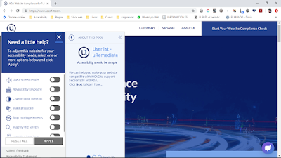
Muy interesante el panel de opciones de accesibilidad que aparece en el sitio web User1st:


lunes, 27 de mayo de 2019

Consulta sobre clase para hipoacúsicos

Hace unas semanas recibí la siguiente consulta:

Estimado Prof. Sergio Luján Mora, en nuestra facultad de Derecho de la Universidad Nacional del Nordeste, Argentina, estamos implementado un política de accesibilidad en diversos ámbitos y me gustaría que me aconseje en el dictado de clases con alumnos con hipoacusia, pensé en pedirle al docente dictante que utilice un micrófono inalambrico conectado a una notebook conectada a internet y utilizar el Speechnotes o similar. 
Las docentes de la cátedra suben la Bibliografía y el material de estudio al aula virtual con antelación a la clase. 
El texto producto de lo que habla el docente se proyectaría en pantalla. Cúales serían sus consejos o recomendaciones acerca de: 
a) modelo de micrófono:
b) software a utilzar, ¿ es bueno tener un software de pago como respaldo en caso de problemas de conexión con internet?, ¿cúal?
c) estragia didáctica:   
espero su valiosa colaboración
saludos cordiales

Y mi respuesta:

No te puedo recomendar un software concreto, pero han surgido muchas opciones disponibles en Internet, además de la que nombras:

https://webcaptioner.com/

https://dictation.io/

https://speechnotes.co/es/

https://speechlogger.appspot.com/es/

https://talktyper.com/

https://www.speechtexter.com/

Y la extensión para Google Chrome:

https://chrome.google.com/webstore/detail/voice-to-text/jdcdafhjjjfnkoeilnjmnadadaoehgdc

El micrófono es importante, pero quizás es mucho más importante la forma de hablar de la persona.

Te recomiendo que revises esta aplicación desarrollada en la Universidad de Alicante, quizás os pueda ayudar:

https://abilityconnect.ua.es/

Y también te recomiendo los siguientes recursos de la Universidad de Alicante sobre cómo afrontar la enseñanza de estudiantes con déficit auditivo:

Déficit auditivo. Accesibilidad Digital.


REGLAMENTO DE ADAPTACIÓN CURRICULAR DE LA UNIVERSIDAD DE
ALICANTE

Adaptación curricular de la Universidad de Alicante: Caso II: Déficit Auditivo

viernes, 24 de mayo de 2019

La accesibilidad mal entendida

Las rampas que se pueden ver en las siguientes fotografías no sirven absolutamente para nada, no mejoran la accesibilidad.

En las páginas web muchas veces ocurre lo mismo, se implementan "rampas digitales" con el objetivo de mejorar la accesibilidad, "rampas digitales" que están mal hechas como las de las fotografías.


miércoles, 22 de mayo de 2019

Las páginas de inicio todavía sobreviven

Las páginas de inicio, splash pages en inglés, fue una terrible epidemia que sufrió la Web a principios del siglo XXI.

Parecía que esta epidemia había sido erradicada, pero no.

En la Universidad Central del Ecuador le tienen cierta estima a las páginas de inicio:


Nada más llegar al sitio web, te plantan una imagen, con un montón de texto, que tapa el resto de la página web y que es difícil de leer porque es una imagen. Usabilidad, cero.

Pero no solo eso, para la accesibilidad es terrible, porque la imagen, claro está, no tiene un texto alternativo:


Y como se puede ver en la captura anterior, la imagen también tiene problemas para adaptarse al tamaño de visualización del dispositivo. Otra vez, usabilidad cero.

lunes, 20 de mayo de 2019

Lo que pasa cuando se usa la Web todo un día solo con el teclado

En I Used The Web For A Day With Just A Keyboard:

SUMMARY

This experiment has been a mixed bag of great keyboard experiences and poor ones. I have three main takeaways.

KEEP IT STYLISH
By far the most common keyboard accessibility issue I’ve faced today is a lack of focus styling for tabbable elements. Suppressing native focus styles without defining any custom focus styles makes it extremely difficult, even impossible, to figure out where you are on the page. Removing the outline is such a common faux pas that there’s even a site dedicated to it.

Ensuring that native or custom focus styling is visible is the single most impactful thing you can do in the area of keyboard accessibility, and it’s often one of the easiest; a simple case of doubling up selectors on your existing :hover styling. If you only do one thing after reading this article, it should be to search for outline: 0 and outline: none in your CSS.

SEMANTICS ARE KEY
How many times have you tried opening a link in a new tab, only for your current window to get redirected? It happens to me every now and again, and annoying as it is, I’m lucky that it’s one of the only usability issues I tend to face when I use the web. Such issues arise from misusing the platform.

Let’s look at this code here:

<span onclick="window.location = 'https://google.com'">Click here</span>
Copy
An able, sighted user would be able to click on the  <span> and be redirected to Google. However, because this is a <span> and not a link or a button, it doesn’t automatically have any focusability, so a keyboard or screen reader would have no way of interacting with it.

Keyboard-users are standards-reliant users, whereas the able, sighted demographic is privileged enough to be able to interact with the element despite its non-conformance.

Use the native features of the platform. Write good, clean HTML, and use validators such as https://validator.w3.org to catch things like missing href attributes on your anchors.

CONTENT IS KEY
You may be required to display cookie notices, subscription forms, adverts or adblock notices.

Do what you can to make these experiences unobtrusive. If you can’t make them unobtrusive, at least make them dismissible.

Users are there to see your content, not your banners, so put these dismissible elements first in your DOM so that they can be quickly dismissed, or fall back to using tabindex="1" if you can’t move them.

Finally, support your users in getting to your content as quickly as they can, by implementing the Holy Grail of ‘skip to main content’ links.

Stay tuned for the next article in the series, where I will be building upon some of these techniques when I use a screen reader for a day.

viernes, 17 de mayo de 2019

Mapas conceptuales de WCAG 2.1

En Intopia Launches WCAG 2.1 Map podemos encontrar dos mapas conceptuales muy interesantes:


miércoles, 15 de mayo de 2019

La negociación estructurada aplicada a la defensa de los derechos de personas con diversidad funcional

La Asociación de Derecho Colaborativo de Euskadi me cuenta lo siguiente:

Os escribimos porque el próximo 7 de junio organizamos una jornada con Lainey Feingold, reputada abogada de California ( USA) y autora del libro Structured Negotiation, donde explica el revolucionario método de la negociación estructurada y su trayectoria. Lainey lleva 20 años negociando con grandes corporaciones americanas ( Citibank, Bank of America, Walmart, Humana, Liga de Béisbol, etc aquí algunos acuerdos) para que sean accesibles para personas con diversidad funcional, especialmente ciegas. Sin interponer ninguna demanda judicial, a través de su modelo de negociación ha conseguido trabajar en equipo con estas entidades, sus proveedores de sistemas y las personas en situación de diversidad funcional y consiguiendo acuerdos sostenibles y reiterados por las mismas entidades . Es todo un referente en las reivindicaciones de accesibilidad digital, y ha sido abogada de ACB ( American Council of the Blind).

Estamos muy emocionadas con su visita y nos gustaría que el 7 de junio fuera una oportunidad para juntar a personas de diferentes ámbitos que apuestan por una accesibilidad global y diversa. Es por ello que nos encantaría poder contar con vosotros, ya que creemos que hay muchas sinergias que podemos compartir.

Además Lainey está muy interesada en conocer la realidad de nuestro país en derechos y reivindicaciones en accesibilidad digital; por lo que encantados de escuchar vuestras necesidades y visiones.

Más información en NUEVA HERRAMIENTA PARA PROFESIONALES COLABORATIVOS: LA NEGOCIACIÓN ESTRUCTURADA.

lunes, 13 de mayo de 2019

WCAG ha cumplido 20 años

El 5 de mayo de 1999, W3C publicó Web Content Accessibility Guidelines 1.0. El W3C lo comunicó en su nota de prensa W3C Issues Web Content Accessibility Guidelines as a Recommendation:

The World Wide Web Consortium today announced the release of the "Web Content Accessibility Guidelines 1.0" specification as a W3C Recommendation. As a W3C Recommendation, the specification is stable, contributes to the universality of the Web, and has been reviewed by the W3C Membership who recommend it as the means for making Web sites accessible. W3C encourages information providers to raise their level of accessibility using this Recommendation.
Un paso fundamental para el desarrollo de WCAG fue la creación de la Web Accessibility Initiative el 22 de octubre de 1997, como podemos leer en World Wide Web Consortium Launches International Program Office for Web Accessibility Initiative:
The World Wide Web Consortium (W3C) today announced the launch of the International Program Office (IPO) for the Web Accessibility Initiative (WAI) to promote and achieve Web functionality for people with disabilities. "The power of the Web is in its universality. Access by everyone regardless of disability is an essential aspect," said Tim Berners-Lee, W3C Director and inventor of the World Wide Web. "The IPO will ensure the Web can be accessed through different combinations of senses and physical capabilities just as other W3C activities ensure its operation across different hardware and software platforms, media, cultures and countries."
Más información sobre este aniversario en:


viernes, 10 de mayo de 2019

Dos cursos en línea sobre accesibilidad digital

Disability and Digital Media: Accessibility, Representation and Inclusion:

Module 1: Introducing digital disability
Module 2: Disability and social media
Module 3: Accessibility and the digital world
Module 4: The future of digital disability


Accessibility: Designing and Teaching Courses for All Learners (HE):

Week 1 - Why Accessibility Matters
Week 2 - Integrating Faculty and Staff Roles
Week 3 - A Blueprint for Equal Learning Opportunities
Week 4 - Taking Action to Provide Equal Learning Opportunities
Week 5 - Methods for Compliant Content Creation
Week 6 - Content Creation Tools and Assistive Technology

miércoles, 8 de mayo de 2019

Accesibilidad web

Conferencia impartida en la Universidad Técnica de Ambato (Ecuador) el 20 de mayo de 2016:

lunes, 6 de mayo de 2019

¿Cuánto sabes sobre accesibilidad web?

Diez preguntas con las que puedes medir tu nivel de conocimiento sobre accesibilidad web: How much do you know about Web Accessibility?

viernes, 3 de mayo de 2019

La accesibilidad muy mal entendida

Hace unas semanas me encontré esto en Internet:


Desgraciadamente, cosas similares pasan muchas veces con la accesibilidad web, se implementan soluciones de forma incorrecta o luego se ponen barreras que impiden su aprovechamiento.

lunes, 29 de abril de 2019

Accessibility Insights

Accessibility Insights es una nueva herramienta de evaluación de la accesibilidad web lanzada por Microsoft.

Está disponible en forma de extensión para Google Chrome.

Y el siguiente vídeo explica su uso:

lunes, 22 de abril de 2019

Cómo reducir las animaciones en una página web

En Move Ya! Or maybe, don't, if the user prefers-reduced-motion! se explica una nueva media query que permite detectar cuándo un usuario no desea animaciones en una página web.

viernes, 19 de abril de 2019

Libro gratuito "Web Accessibility for Developers"

Web Accessibility for Developers:

Web Accessibility for Developers is a technical book aimed primarily at programmers. Learn how to develop accessible interactivity on the Web and gain expertise using WAI-ARIA, a W3C specification that enables optimal use of assistive technologies, like screen readers, when navigating the Web.

miércoles, 17 de abril de 2019

Desastre de imágenes en Naukas

En el sitio web Naukas, el uso del texto alternativo con las imágenes es un verdadero desastre:

Tenemos los típicos botones (imágenes que son enlaces) de redes sociales:


que están hecho con iconos y sin un texto equivalente (no se puede poner un texto alternativo porque las imágenes no están en el HTML, están en el CSS):


Tenemos los típicos enlaces contiguos, uno con una imagen, otro con texto, que tienen el mismo texto y el mismo destino:


Y tenemos las típicas imágenes en enlaces sin texto alternativo:


lunes, 15 de abril de 2019

Errores de accesibilidad en la web de El Corte Inglés

La web de El Corte Inglés tiene algunos errores de accesibilidad curiosos. Por ejemplo, un enlace que contiene una imagen con un texto alternativo y el mismo texto al lado.


O un enlace al que le han puesto el atributo alt:


viernes, 12 de abril de 2019

El mercado de los servicios de evaluación de la accesibilidad web crecerá los próximos años

Según Accessibility Testing Service Market is slated to grow rapidly in the coming years:

Accessibility Testing is defined as a type of Software Testing performed to ensure that the application being tested is usable by people with disabilities like hearing, color blindness, old age and other disadvantaged groups.

Global Accessibility Testing Service Market documents a detailed study of different aspects of the Global Market. It shows the steady growth in market in spite of the fluctuations and changing market trends. The report is based on certain important parameters.

Some of key competitors or manufacturers included in the study are: , QA InfoTech, QualiTest, Planit, QualityLogic, Siteimprove, Invensis, Knowbility, Applause, QA Consultants, Intopia, Interactive Accessibility, Paciello Group, Happiest Minds, TestingXperts, Zoonou, Octaware, BarrierBreak, AccessibilityOz, Ten10, BugFinders, Magic EdTech, 360Logica, Sopra Steria, Deque Systems, Saffron Tech, Criterion 508

The rising technology in Accessibility Testing Service market is also depicted in this research report. Factors that are boosting the growth of the market, and giving a positive push to thrive in the global market is explained in detail. It includes a meticulous analysis of market trends, market shares and revenue growth patterns and the volume and value of the market. It is also based on a meticulously structured methodology. These methods help to analyze markets on the basis of thorough research and analysis.

lunes, 8 de abril de 2019

Curso "Materiales digitales accesibles (3ed)"

Materiales digitales accesibles (3ed) es un curso perteneciente al Canal Fundación ONCE en UNED Abierta. Financiado por el Real Patronato sobre Discapacidad del Ministerio de Sanidad, Consumo y Bienestar Social del Gobierno de España.

El calendario del curso es:

  • Inicio del curso: 1 de abril de 2019
  • Fin de la atención tutorial: 5 de mayo de 2019
  • Cierre del curso: 8 de septiembre de 2019
El temario del curso es:

  1. Materiales digitales
  2. Accesibilidad de material multimedia (información sonora y visual)
  3. Accesibilidad de textos digitales (textos e imágenes)
  4. Mini-vídeos Docentes Modulares
  5. Mini-libros Electrónicos Modulares
Y el vídeo de presentación del curso:

viernes, 5 de abril de 2019

Los subtítulos no solo ayudan a las personas con discapacidad

Muy interesante todo lo que se explica en Why Gen Z Loves Closed Captioning:
Closed captioning is a relatively recent development in the history of broadcasting, and it was designed with the hearing impaired in mind. According to a useful history on the National Captioning Institute’s (NCI) website, the technology dates back to the early 1970s, when Julia Child’s The French Chef “made history as the first television program accessible to deaf and hard-of-hearing viewers.” Real-time captioning arrived later, with stenographers typing at a blazing 250 words-per-minute to keep up with live news and sporting events.
If it wasn’t for the Twenty-First Century Communications and Video Accessibility Act of 2010 and additional rules adopted by the FCC in 2012, it’s unlikely my daughter’s IP-based Netflix streaming content would even have closed captioning options today.
While the NCI doesn’t explicitly acknowledge the growing use of closed captioning by those without hearing impairments, it does note that “closed captioning has grown from an experimental service intended only for people who are deaf to a truly global communications service that touches the lives of millions of people every day in vital ways.”
It’s certainly not just a phenomenon for young people. There are many people my age who admit to using them because they have some middle-aged hearing loss or simply need help understanding what the characters on Luther or Peaky Blinders are saying. They use captions to focus more intently on the content.
The need to read captions for what you can hear might even have a biological base. According to Dr. Sudeepta Varma, a psychiatrist at New York University’s Langone Medical Center, some people may have trouble processing the audio from television.

jueves, 4 de abril de 2019

Educación inclusiva en universidades presenciales

Conferencia impartida en el V Foro de Academia Innovadora "Fomentando una cultura de innovación, diálogo y accesibilidad con el apoyo de las TIC" en la Universidad Nacional de Costa Rica el 20 de septiembre de 2017:

miércoles, 3 de abril de 2019

Cómo trabaja un programador ciego

En Así es como trabaja un programador ciego, se cuenta:

Tuukka Ojala es un desarrollador de software ciego originario de Finlandia. Cuando trabaja, mantiene su computadora portátil cerrada tiene un teclado externo conectado a ella con la que puede realizar su trabajo de una manera peculiar y extraordinaria.

lunes, 1 de abril de 2019

Las cinco reglas de ARIA

En Using ARIA:
  1. First Rule of ARIA: If you can use a native HTML element or attribute with the semantics and behavior you require already built in, instead of re-purposing an element and adding an ARIA role, state or property to make it accessible, then do so.
  2. Second Rule of ARIA Use: Do not change native semantics, unless you really have to.
  3. Third Rule of ARIA Use: All interactive ARIA controls must be usable with the keyboard.
  4. Fourth Rule of ARIA Use: Do not use role="presentation" or aria-hidden="true" on a focusable element.
  5. Fifth Rule of ARIA Use: All interactive elements must have an accessible name.

Y en español:
  1. Primera regla de ARIA: si puede usar un elemento o atributo HTML nativo con la semántica y el comportamiento que ya necesita, en lugar de reutilizar un elemento y agregar un rol, estado o propiedad de ARIA para hacerlo accesible, entonces hágalo.
  2. Segunda regla de ARIA: no cambie la semántica nativa, a menos que realmente tenga que hacerlo.
  3. Tercera regla de ARIA: todos los controles interactivos de ARIA deben poder utilizarse con el teclado.
  4. Cuarta regla de ARIA: no use role="presentation" o aria-hidden="true" en un elemento enfocable.
  5. Quinta regla de ARIA: todos los elementos interactivos deben tener un nombre accesible.

Desastre de contraste en la web de Turkish Airlines

En una página web de la web de Turkish Airlines hay que elegir un país en una lista desplegable. El país seleccionado se puede ver con mucha dificultad, el resto de países, ¿hay más países en la lista?