Buscador

lunes, 14 de diciembre de 2020

DIferentes tipos de auditoría de accesibilidad

 En What to look for in an accessibility audit explican los diferentes tipos de auditoría que existen:

  • Level-of-effort (LOE) Audit: A report which estimates the magnitude and cost of an accessibility remediation project. The report includes the number of pages to fix and the number of defects on each page.
  • Risk Audit: Identifies severe and critical blockers that users with disabilities would encounter. This report does not include remediation recommendations.
  • Detailed Audit: Identifies improvement based on the client’s preferred standards (WCAG 2.0 A/AA, WCAG 2.1 A/AA, or Section 508) using automated and manual testing that covers the scope of the client’s choosing. This report provides remediation recommendations.
    • Detailed audits are also available for specific regulations or technologies – such as CVAA, Kiosks, and native mobile apps.
  • Screen Reader Acceptance Testing: Experts will test a task/use case/user flow for assistive technology/browser/OS version combinations of the client’s choosing and provide a rating on a scale of difficulty or failure.
  • Validation Audit: Performed on a web page, set of web pages, or applications that have previously undergone an audit by Deque. Validation audits may also be done on mobile apps or PDFs too.
  • Usability Testing: Accessibility (conformation to WCAG or Section 508) does not always lead to usability. Usability testing reveals what’s usable to people with disabilities.
  • Accessibility Conformance Statements: A Conformance Statement is a document from a trusted third party that details the level of accessibility for your organization’s website or application.
  • Voluntary Product Accessibility Template (VPATs): A procurement report required for selling web-based software to the US Federal Government under Section 508.
  • Design Audits: A Design Comp Accessibility Annotation (DCAA), is a markup of UX and UI wireframes and comprehensive designs (comps) with accessibility requirements for developers.

miércoles, 9 de diciembre de 2020

Descripciones largas en Google Chrome

 Google Chrome permite generar de forma automática la descripción de una imagen que no tenga un texto alternativo, tal como podemos leer en Obtener descripciones de imágenes en Chrome.

Según se explica en Using AI to give people who are blind the “full picture”, parece que esta función se añadió en octubre 2019.

lunes, 7 de diciembre de 2020

Aviso de vídeo que puede provocar epilepsia por fotosensibilidad

 El vídeo CYBERTRUCK vs F150 │ The REAL 1:64 STORY tiene el siguiente aviso al principio:


Aquí está el vídeo, para el que quiera probar:

jueves, 3 de diciembre de 2020

Día Internacional de las Personas con Discapacidad

 Hoy 3 de diciembre se celebra el Día Internacional de las Personas con Discapacidad:

El Día Internacional de las Personas con Discapadidad fue declarado en 1992 por la Asamblea General de las Naciones Unidas mediante la resolución 47/3. El objetivo es promover los derechos y el bienestar de las personas con discapacidades en todos los ámbitos de la sociedad y el desarrollo, así como concienciar sobre su situación en todos los aspectos de la vida política, social, económica y cultural.

viernes, 27 de noviembre de 2020

Una buena colección de vídeos sobre diseño inclusivo

El pasado 17 de septiembre de 2020 se celebró el Inclusive Design 24:

A free 24-hour online event for the global community. It celebrates inclusive design and shares knowledge and ideas from analogue to digital, from design to development, from planners to practitioners, and everything and everyone in between.

Todos los vídeos del evento están disponibles en la lista Inclusive Design 24.

miércoles, 25 de noviembre de 2020

Las diferencias entre la navegación por teclado y la navegación mediante lector de pantallas

En The difference between keyboard and screen reader navigation se aclaran las diferencias entre la navegación por teclado y la navegación mediante lector de pantallas:
People often include screen reader users in the much larger group of keyboard-only users. Whilst this is correct (most screen reader users don’t use a mouse), it also creates a false impression of the way screen reader users navigate content.
To help explain this, I’m going to generalise and refer to the two following groups of people:
  • Keyboard users: people who don’t use a mouse but can see the content.
  • Screen reader users: people who don’t use a mouse and can’t see the content.
This is a massive over-simplification of the different groups, but the ability to see the content or not is the crux of the difference in navigation.

Keyboard navigation

Keyboard users navigate through content using a limited set of keyboard shortcuts:

  • The tab key moves to the next focusable element (like a link, button, or form field) and scrolls it into view if it wasn’t already contained within the viewport. The shift and tab keys together move to the previous focusable element.
  • The space key scrolls the next chunk of content into view, and the shift and space keys together scroll the previous chunk of content into view. The pagedown and pageup keys do the same things respectively.
  • The home key brings the top of the page into view, and the end key brings the bottom of the page into view.

This isn’t a very refined way of navigating content, and it isn’t without problems, but it generally works if you can see the content as it moves into view. That, of course, is where screen reader users come unstuck.

Screen reader navigation

Apart from things like live regions, screen readers only speak the content they’re focused on, and here we need to draw an important distinction: keyboard focus and screen reader focus are not the same thing!

Keyboard focus is restricted to tabbing between focusable elements. If a screen reader user uses the tab key to navigate content, all they will hear is the name of each focusable element as it receives keyboard focus. What they won’t hear is all the other content like text, headings, and images.

When using the tab key, keyboard focus and screen reader focus are synchronised with each other. The rest of the time, screen reader users have an enormous range of commands at their disposal for reading and navigating content independently of keyboard focus. The commands vary between screen readers, but they all have one thing in common: they’re tied to different HTML elements. There are commands for moving screen reader focus between things like headings, images, paragraphs, sectioning elements, lists and listitems; for moving between tables, as well as the rows and columns inside them; for moving to specific types of form field, like checkboxes, radio buttons, text fields, or buttons; and many more commands besides.

lunes, 23 de noviembre de 2020

No todo es alto contraste, también hay gente que necesita bajo contraste

Las Pautas de Accesibilidad del Contenido Web, Web Content Accessibility Guidelines (WCAG) 2.1, tiene tres criterios de éxito sobre el contraste mínimo de los elementos de una página web:

Sin embargo, no dice nada de lo contrario, el contraste máximo. Pero ¿pueden existir personas que tenga problemas cuando el contraste sea excesivo?

Sí, hay personas que pueden tener problemas.

En Accessibility and me: Marian Foley podemos leer:

I've been partially sighted since I was 9, and need large text and low contrast colours to be able to work. My requirements are quite unusual for someone with sight loss, as most visually impaired users need high contrast colours. My retinas can't process colour contrast properly, and spending more than a couple of minutes looking at high contrast material (web pages, documents, anything with regular stripes, spots or checks) gives me a splitting headache and motion sickness.

Y en este mensaje de Twitter:

Does anyone who works in accessibility for @Microsoft or @Apple follow me? I'd like to discuss settings needed for those with Irlen Syndrome. To us, text wobbles like an optical illusion. Luckily, it can be fixed with low-contrast color overlays, but that feature doesn't exist.

Según la Wikipedia, el síndrome de Irlen es:

Irlen syndrome, occasionally referred to as scotopic sensitivity syndrome (SSS) or Meares-Irlen syndrome, very rarely as asfedia, and recently also as visual stress, is a proposed disorder of vision.

viernes, 20 de noviembre de 2020

Así es como usan Internet muchas personas ciegas

 En Así es como usa Internet un ciego. Al menos algunos se cuenta:

Si bien es cierto que la mayoría podemos hacernos una ligera idea de las incomodidades a las que se ven sometidas las personas que padecen algún tipo de discapacidad visual, lo cierto es que pocos somos conscientes de cómo estos individuos se desenvuelven en determinados entornos y actividades.

Es el caso de la navegación por Internet, un acceso sin el que muchos seríamos incapaces de “vivir” y que Facebook y otras plataformas tratan de poner más fácil. Pero, ¿en qué consisten estas iniciativas? ¿Cómo lo logran exactamente? ¿De qué herramientas se valen? Analizamos el contexto actual y les preguntamos a algunos de ellos.

miércoles, 18 de noviembre de 2020

Comparativa de plugins para evaluar la accesibilidad web

Muy interesante el artículo Comparing accessibility evaluation plug-ins:

This article reports the results of a study comparing evaluation accessibility plugins extensions for the Chrome web browser. Eight of the most well-known tools among developers were chosen. All tools are free or available under an open-source license, and work with the Chrome browser. The tools were compared based on their feature set, their usability and their evaluation results of ten of the Alexa top websites. We found that individual tools still provide limited coverage of the success criteria; the coverage of success criteria varies quite a lot from evaluation engine to evaluation engine; what are the most and least covered success criteria in automated evaluations. After analysing the results, we highly recommend to use more than one tool (with a different engine) and to complement automated evaluation with manual checking.
 

lunes, 16 de noviembre de 2020

Una crítica a los sistemas que prometen accesibilidad web con una sola línea

 Según Eric Eggert, los accessibility overlay basados en inteligencia artificial no cumplen lo que prometen. Lo cuenta en su vídeo 5 False Claims 1-Line “AI” Accessibility Script Vendors Make:

Y el inicio de la transcripción:

They claim to be the be-all and end-all of all accessibility worries: “AI” accessibility tools. They say they provide “100% WCAG 2.1 compliance”. They say it only takes one line of JavaScript to “fix your website for accessibility”.

Who are “they”? VC-backed companies that promise affordable, effortless compliance for your website. If you think “that sounds too good to be true”, you’re right. It is indeed quite the opposite of true.

Here are five claims that “AI” accessibility script vendors make that are misleading or completely untrue.

(Intro.)

I’m Eric Eggert, a Web Accessibility Expert. You can follow me as @yatil — Y-A-T-I-L — on social media. If you have questions about this or other videos, or want to propose a topic, ask in the comments, or use the hashtag #askYatil on Twitter.

Before we get into it, whenever I say AI, please imagine the most expressive air-quotes gesture possible.

Okay!


viernes, 13 de noviembre de 2020

Seminario Permanente sobre Discapacidad PUDH-FCPyS UNAM

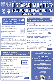
 El próximo 17 de noviembre de 2020 participaré en el Seminario Permanente sobre Discapacidad PUDH-FCPyS UNAM Discapacidad y TIC's: ¿Exclusión virtual y digital? organizado por la Universidad Nacional Autónoma de México. Este seminario comienza el 3 de noviembre.

Cartel de promoción del evento

Más información en la página de Facebook.


miércoles, 11 de noviembre de 2020

Semántica, ARIA y lectores de pantalla

Assistive technologies (ATs), which are hardware and software that help us perceive and interact with digital content, come in diverse forms. ATs can use a whole host of user input, ranging from clicks and keystrokes to minor muscle movements. ATs may also present digital content in a variety of forms, such as Braille displays, color-shifted views, and decluttered user interfaces (UIs). 
One more commonly known type of AT is the screen reader. Programs such as JAWS, Narrator, NVDA, and VoiceOver can take digital content and present it to users through voice output, may display this output visually on the user’s screen, and can have Braille display and/or screen magnification capabilities built in. 
If you make websites, you may have tested your sites with a screen reader. But how do these and other assistive programs actually access your content? What information do they use? We’ll take a detailed step-by-step view of how the process works.

viernes, 6 de noviembre de 2020

Un 6,1% de los empleados de Microsoft presenta algún tipo de discapacidad

 Este dato se puede leer en el artículo Microsoft Reveals 6.1% Disability Representation For The First Time:

A newly released report from Microsoft reveals that 6.1 % of the company’s U.S. employees self-identify as disabled, meaning they have a physical, mental or cognitive disability. If you’re not quite sure how to put that number in context, that’s because few companies ever disclose similar numbers. This is the first time Microsoft has included disability in their annual diversity and inclusion report—and although the number may be modest, its significance will be understood worldwide.

[...]

Microsoft already employs people with all types of disabilities and is actively looking for new ways to be inclusive. The company has slowly and persistently chipped away at the issue since Satya Nadella became CEO in 2014. It takes patience and persistence to move the needle. Even the basics can’t be taken for granted. Many Americans don’t know that most disabilities are not visible, likely because they are not openly discussed and can be a source of shame or stigma. “Diabetes, dyslexia, and depression are three great examples of this. To understand our representation, we need data which means cultivating a workplace where employees can be confident, have pride in their disability and ultimately, confidentially self-identify whether they have a disability or not,” says Lay-Flurrie. 

[...]

Microsoft defines disability, using the definition of disability from the World Health Organization in both in internal conversation and external conversations: “Disability is not just a health problem. It is a complex phenomenon, reflecting the interaction between features of a person’s body and features of the society in which he or she lives.”

miércoles, 4 de noviembre de 2020

Accesibilidad de los reproductores multimedia

En How accessible is the HTML video player? han analizado la accesibilidad de los reproductores multimedia. La conclusión es:
In case you don’t make it all the way to the bottom, I feel, based on the results of testing each player (and comparing to my own Accessible Video Player project), that relying on native video players should be used with caution. This is my opinion stemming from experience, but I found most to have poor keyboard and screen reader support, which may lead to frustrated users. 
There were a lot of inconsistencies across the board as far as keyboard and screen reader support. Some lose focus when the video controls receive focus then fade away, forcing the user to re-position themselves to adjust playback. Others did not trap keyboard focus in full-screen mode, leading to a similar situation as an inaccessible modal window allowing content to be accessed "behind" the window. One player in particular featured very awkward keyboard support where controls were visible on the screen but could not be focused.

viernes, 30 de octubre de 2020

Curso gratuito "¿Cómo diseñar y programar sitios web accesibles?"

 El curso gratuito ¿Cómo diseñar y programar sitios web accesibles? tiene el siguiente contenido:

  • Introducción a la accesibilidad web
  • Estándar WCAG 2.1.
  • Organización del estándar
  • Tecnologías de asistencia
  • Destinatarios del WCAG
  • Principios, pautas y criterios
  • Niveles de conformidad.
  • Accesibilidad en elementos gráficos.
  • Accesibilidad en hipervínculos.
  • Accesibilidad en controles de formulario.
  • Accesibilidad en tablas
  • Accesibilidad en la estructura de una página.
  • Accesibilidad en el contenido.
El curso tiene estos prerrequisitos:

  • Estar matriculado en alguna institución educativa de educación superior.
  • Tener conocimientos de HTML, CSS y JavaScript.
  • Disponer de 6 horas por semana durante tres semanas, para el estudio de los contenidos y la realización de las prácticas y tareas.

miércoles, 28 de octubre de 2020

Cómo diseñar para lectores de pantalla

It’s easy to think about a layout as being a primarily visual concern. The header goes up top, the sidebar is over here, the call to action is in an overlay on top of the content (just kidding). Grids, borders, spacing and color all portray valuable visual data, but if these hints to the structure of a page are only visible, some users may find your content unintelligible.
You can experience this first hand if you try using a screen reader on the web. When I fired up VoiceOver on my Mac and took it out for a test drive, I realized that to a screen reader user, a lot pages are just a big heap of ‘content’, missing helpful organizational cues. 
The experience can be kind of like listening to a long rambling story without any indication to what details are important or related to the main thread of the story. Halfway through the story, you aren’t sure whether it’s worth it to keep listening because you don’t know if you’ll even find what it is you’re looking for. In the context of a website, your screen reader might be halfway through reading you a list of 50 sidebar links when you start wondering if there is any valuable content on the site at all.
Experiences like this are caused by websites that are built with layouts that are only visual. Ideally, however, our visual layouts should point to an underlying organizational model of our content. They should be visual indicators for a conceptual model. The visual indicators are just one way of revealing this model. The Web Accessibility Initiative’s ARIA (Accessible Rich Internet Applications) project provides alternative indicators to users who may need them. 
I’ll walk through how to make use of these indicators to make a simple web page easy to use, navigate and read for users of assistive technology. All the example code is available on github.

lunes, 26 de octubre de 2020

Las novedades de WCAG 2.2

En Web Content Accessibility Guidelines (WCAG) 2.2 Draft for Review, el W3C explica las novedades de WCAG 2.2:

  • 2.5.7 Dragging
  • 2.5.8 Pointer Target Spacing
  • 2.4.11 Focus Appearance (Minimum)
  • 2.4.12 Focus Appearance (Enhanced)
  • 2.4.13 Fixed Reference Points
  • 3.2.6 Findable Help
  • 3.2.7 Hidden Controls
  • 3.3.7 Accessible Authentication
  • 3.3.8 Redundant Entry

En What’s New in WCAG 2.2WCAG 2.2 Overview and Feedback se analizan las novedades que tiene WCAG 2.2 hasta el momento actual, ya que todavía es un borrador, no es la recomendación final.

miércoles, 21 de octubre de 2020

Accessibility Maze, un juego accesible sobre accesibilidad

Accessibility Maze es un juego serio accesible sobre accesibilidad:
For people who do not experience barriers, it can be difficult to empathize with the challenges that people with disabilities often face when navigating the Web. The Accessibility Maze was created to help those new to web accessibility experience firsthand what it is like to encounter those barriers. The game introduces a number of common barriers players must work around, mirroring the experience of those who encounter these obstacles daily, and provides quick lessons on how to avoid or correct them. 
In creating the game we wanted to ensure it would be accessible. Gaming being one of the more challenging areas in which to address accessibility, the Accessibility Maze has been created to be playable with a current screen reader, using only a keyboard, and to demonstrate strategies for making games accessible.

lunes, 19 de octubre de 2020

Ejemplo de uso de un lector de pantalla

El vídeo Enciende tu ordenador. Desenchufa el ratón. Desconecta la pantalla... ¡Y ponte a trabajar,! dice:
¿Te has planteado qué pasaría si de repente no pudieras utilizar la pantalla de tu ordenador? ¿Te ves capaz de manejarlo sin poder verlo? ¿Y un iPhone? ¿Es eso posible?
En este vídeo veremos cómo las personas ciegas hacemos uso de la tecnología, y cómo ésta nos permite ser mucho más independientes siempre que sea accesible. Adéntrate conmigo en una realidad diferente que seguro te sorprenderá.

viernes, 16 de octubre de 2020

Nueva ley sobre accesibilidad web en EEUU

Según Introduced Online Accessibility Act Would Amend ADA, Clarify Web Accessibility Compliance Standards, en EEUU se ha propuesto Online Accessibility Act, una nueva ley sobre accesibilidad web que se añadirá a la famosa Americans with Disabilities Act (ADA) de 1990.

El borrador de la ley añadirá un nuevo título de sección:

TITLE VI—CONSUMER FACING

WEBSITES AND MOBILE APPLICATIONS OWNED OR OPERATED BY A PRIVATE ENTITY

Que entre otras cosas, dice:

(1) IN GENERAL.—A consumer facing website or mobile application shall be considered compliant under the requirements of this section if such website or mobile application is in substantial compliance with the Web Content Accessibility Guidelines (referred to in this title as WCAG) 2.0 Level A and Level AA standard established by the Accessibility Guidelines Working Group, or any subsequent update, revision, or replacement to the WCAG 2.0 Level A and Level AA standard published by the World Wide Web Consortium or successor organization.

lunes, 12 de octubre de 2020

Personas con discapacidad se reconvierten en programadores

 Según una nota de prensa de la Fundación Once y Por Talento Digital:

Un total de veintiséis personas con discapacidad de Madrid, Barcelona y Valencia han finalizado el curso ‘Programación para No Programadores’, que se lleva a cabo dentro de la iniciativa Por Talento Digital (http://www.portalentodigital.es/) de Fundación ONCE, con la colaboración de Inserta Empleo y el proveedor de formación OPINNO.

El curso comenzó el pasado mes de diciembre con medio centenar de alumnos de los que la mitad lo han terminado. En total han sido 800 horas de formación, desarrollada en tres ciudades como son Madrid, Barcelona y Valencia. Además, ha contado con el apoyo de Fundación Vodafone España y Mastercard.

El curso Programación Web Full-Stack para no programadores no requería formación previa en programación precisamente para dar una oportunidad de reciclar profesionalmente a las personas que no venían del terreno tecnológico, ofreciéndoles así el reto de formarse en una de las profesiones tecnológicas más demandadas actualmente en el mercado laboral.

Tuvo dos fases. La primera contaba con la cofinanciación de la Fundación Vodafone España, y durante sus 250 horas sirvió para fijar los conceptos y tecnologías básicas de programación, a través de lenguajes como c# o java.

La segunda fase, que comienza ahora, es una formación especializada de 550 horas en programación web, front y backend, donde los alumnos aprenderán fundamentos web basados en estándares como Javascript, CSS, html, Angular o next js.  

Para esta nueva modalidad online se está utilizando la plataforma Discord (que permite crear grupos de trabajo, aulas, etc.), así como la extensión Visual Studio Code para compartir el código de desarrollo. Ha sido necesario implementar algunas adaptaciones de accesibilidad para asegurar el acceso en igualdad de condiciones a todo el alumnado en este nuevo formato. 

Por ejemplo, para una alumna con discapacidad auditiva en la sede de Madrid se ha incorporado una herramienta de subtitulado automático que permite seguir las explicaciones del profesor. Además, para otro alumno sordo signante de Barcelona se ha dispuesto una herramienta para que pueda contar con la intérprete de lengua de signos en remoto.

Además de la formación teórica, ha habido un fuerte componente de toma de contacto con el mundo empresarial. Así, han impartido masterclasess a los beneficiarios responsables de Microsoft, Between, Avanade, El Corte Inglés, Deloitte, Souji y Nutrilieve.  

Por otro lado, se organizaron 3 sesiones de Speed Dating a través de Zoom, en las que participaron profesionales de Everis, Avanade, BMAT, RECUBIK, Super Squad Interactive, Pavapark, ALZIS, KIWA, Everycode, GFI, Fundación Universia, Nutrilieve, Go Zero Waste, Smart Monkey, Jump Data Driven, It Will Be y Voices of Leaders. El objetivo de estas sesiones era que las empresas conociesen a los alumnos para poder ofrecerles prácticas no laborales que completen la formación teórica que han recibido. 

viernes, 9 de octubre de 2020

Vïdeos sobre accesibilidad de Google

En Google Accessibility hay una enorme colección de vídeos sobre accesibilidad.

lunes, 5 de octubre de 2020

Seminario Permanente sobre Discapacidad PUDH-FCPyS UNAM

 El próximo 17 de noviembre de 2020 participaré en el Seminario Permanente sobre Discapacidad PUDH-FCPyS UNAM Discapacidad y TIC's: ¿Exclusión virtual y digital? organizado por la Universidad Nacional Autónoma de México. Este seminario comienza el 3 de noviembre.

Cartel de promoción del evento

Más información en la página de Facebook.


viernes, 2 de octubre de 2020

Cuidado con las herramientas automáticas de revisión de la accesibilidad web

En Use Caution with Automated Tools that Promise 100% Accessibility Compliance se explica:
Automated accessibility testing tools, powered by artificial intelligence (AI) and code-scanning technology, can be an important part of an accessibility testing plan — but, they must remain just a part. Automated testing on its own should not replace manual testing by an accessibility expert and should not be used as the only way to show compliance.
Y avisa del peligro del texto alternativo generado de forma automática mediante inteligencia artificial:
As technology advances, there are even image-recognition programs that can with some accuracy guess what an image depicts and generate alt text. On one hand, it's incredible that this technology exists. On the other, it presents an additional layer of review required by human beings. The real purpose of an image in the context of a web page, the real feeling somebody is supposed to be exposed to, the real information conveyed by an image can't be decided by a machine — at least not yet.

miércoles, 23 de septiembre de 2020

Experiencia equivalente

Muy interesantes, llenos de ejemplos, los artículos Equivalent Experiences: What Are They?Equivalent Experiences: Thinking Equivalently publicados en Smashing Magazine.

El resumen dice:
An equivalent experience is one that has been deliberately conceived of and built to be able to be used by the widest possible range of people. To create an equivalent experience, you must understand all the different ways people interact with technology, as well as common barriers they experience. 
Constructing an equivalent experience may mean changing the way you think about development and design, and potentially reevaluating your existing work. In this article, we’ll address common accessibility issues, and how to best go about improving them so everyone can effortlessly access your content.

viernes, 18 de septiembre de 2020

¿Qué son las características accesibles de un sitio web?

En What Are Accessibility Features of a Website? explican qué son las características accesibles que ofrecen algunos sitios web:
Website accessibility features are the elements of a site designed to improve the ability of people with disabilities to independently use it. Sometimes websites include extra options specifically to enhance some people's use, but usually accessibility features are integrated into a well-coded website that is accessible by default.
Aunque normalmente estas características que se añaden con muy buenas intenciones, a veces pueden causar problemas a ciertos usuarios:
Sometimes, extra accessibility features are added with the best of intentions, but in practice can actually cause new problems. For example, some websites or digital tools will include their own screen reading technology with the goal of providing easy access to people who are blind, have low vision, or otherwise benefit from hearing content instead of or in addition to seeing it. However, many people who need to use screen readers already use one and likely have a go-to screen reader they prefer for that particular type of content, web browser, or device. In this example, the extra screen reader might interfere with the native screen reader, or vice versa, and accessibility will have been compromised, not improved.
Another common example are keyboard shortcuts. Some websites will offer custom keystroke combinations designed to save the user time or make interaction easier, and sometimes these can be helpful. Other times, however, keyboard shortcuts might interfere with screen reader or other assistive technology commands, or with keyboard shortcuts that users who need them most already have programmed. Again, in this example, something intended to improve accessibility can make the website unusable if not done carefully.

miércoles, 16 de septiembre de 2020

Los enlaces "saltar a" son importantes

Muy interesante la explicación y el código que se ofrece en Skip links are important:
"Skip links" are important. They allow keyboard-only users, sighted or not, to bypass large or repetitive blocks of content. You may have heard of them and wondered what the big deal is. Or your design team may have refused to implement one because they look “ugly”. But they are important, and they don’t have to break the design. 
Lots of links
Many sites have a lot of links at the top of the page. The mega menu isn’t dead! It seems like news websites are particularly bad with this. The Montreal Gazette has over 175 links before reaching the main content. CNN does better, with only 19 links. The Austin Statesman “only” has 18 or so, but the very first link isn’t keyboard-friendly, and it’s the “navigation menu”. The navigation menu has nearly 60 links! Perhaps it’s just as well it’s not keyboard accessible? Stuff has a couple dozen links (and no focus visible - but that’s a story for another day).
All these links before the main content mean that a keyboard-only user has to tab through every single link before they can reach or interact with the main content. This is not a great experience.
Screen reader users are keyboard-only users. Their assistive technology allows them to navigate to different areas of a page, by using landmarks or headings, for example (if they’ve been implemented on the site). But sighted keyboard-only users don’t have that luxury, because browsers don’t (yet?) allow this kind of navigation.
Not just top content
Another area of concern can be social media embeds, such as Twitter feeds. These may have as many as 200 links to tab through before being able to get to the other content. 
Compliance
It’s important to make your visitor’s life easier by allowing them to bypass blocks of links. But it’s not just about making their life easier. It’s also about compliance. WCAG success criteria 2.4.1 Bypass Blocks requires this. I generally don’t like to push accessibility from a compliance perspective. But it’s important to note that factor.
En el artículo se ofrece el código para implementar correctamente los "skip links".

lunes, 14 de septiembre de 2020

Accesibilidad en Android

Para los usuarios ciegos o con baja visión:
Para los usuarios con problemas de movilidad:

Para los usuarios sordos o con problemas de audición:
Para los usuarios con problemas cognitivos o de aprendizaje:

viernes, 11 de septiembre de 2020

16 cosas que se pueden hacer para mejorar la accesibilidad de un sitio web

16 Things to Improve Your Website Accessibility está escrito por Bruce Lawson, un gurú de la accesibilidad web.

Las 16 cosas que propone son:

1) Too Much Content
In brief: break up text into sections with headings and bulleted lists. Use simple language.

2) ReCAPTCHA
In brief: don’t make your users jump through potentially impossible hoops in order to save developer time.

3) Poor Legibility
In brief: make sure text has adequate contrast, is readable and isn’t justified.

4) Distracting Images and Graphics
In brief: allow users to stop any movement; respect their operating system settings; don’t auto-play video.

5) Poor Link Information
In brief: make links identifiable, with unique link text. Warn users if a link will open a new tab or a file.

6) Another Design Error: Removing the Focus Ring
In brief: make sure a keyboard user can always see where they are currently focused.

7) Form Filling
In brief: design form fields that look like form fields, each associated with a label. Don’t disable auto-fill.

8) Provide Text Alternatives for All Images, Video, and Audio
In brief: any information communicated through an image or video must have a textual equivalent.

9) Add Proper Document Language
In brief: let assistive technology know the language that your text is in.

10) Help a Visitor Get Around Your Content
In brief: use HTML landmark elements to help assistive technology users understand and navigate your content.

11) Use HTML Properly
In brief: understand the semantics and default behaviors of HTML elements; use the right element for your content.

12) Complex Interactions
In brief: Use ARIA only when a native semantic doesn’t exist; use the design patterns and code suggested by W3C.

13) Frameworks
In brief: frameworks aren’t inherently inaccessible if you choose your components wisely.

14) Content Management Systems and Site Builders
In brief: choose CMS and Site Builder themes carefully.

15) PDF
In brief: PDFs can be made accessible. Make sure your PDFs are so.

16) Keep Testing
In brief: test! With real people, if you can.

miércoles, 9 de septiembre de 2020

El atributo placeholder no es una etiqueta, no sustituye a label

Just so we’re all clear on this, the HTML5 placeholder attribute in a text input is not a replacement for the label element. Period. The placeholder should only be used as a brief example of the text to be entered. 
Besides inconsistent support for screen readers, using a placeholder as an input label can create usability problems and issues for those with cognitive impairments. For example, how does one review the information entered if the placeholder is now gone? 
The placeholder should be used like a title attribute (tooltip); it provides only supplementary information. If the information is required for the user (such as a strict text format) then this should be conveyed in the main content of the page, not in an attribute.

lunes, 7 de septiembre de 2020

Pautas de diseño para personas mayores

En 4 Tips for Designing Apps for Older Users se dan estos cuatro consejos:
  1. Haz el texto fácil de leer
  2. Agranda el tamaño de los elementos interactivos
  3. Divide las tareas y haz una cosa cada vez
  4. Mantén los textos claros y simples

viernes, 4 de septiembre de 2020

Novedades de WCAG 2.2

 El 11 de agosto de 2020 se publicó una nueva versión de WCAG 2.2. Todavía sigue siendo "working draft", pero el documento ha avanzado bastante respecto la versión anterior. Las principales diferencias respecto a WCAG 2.1 son nueve nuevos criterios de éxito:

  • Accessible Authentication
  • Dragging
  • Findable Help
  • Fixed Reference Points
  • Focus Appearance (Minimum)
  • Focus Appearance (Enhanced)
  • Hidden Controls
  • Pointer Target Spacing
  • Redundant Entry

viernes, 28 de agosto de 2020

Herramienta para evaluar la accesibilidad de las herramientas de autor

El W3C ha creado ATAG Report Took, que guía al usuario en la evaluación de la accesibilidad de las herramientas de autor.

lunes, 24 de agosto de 2020

Consejos para mejorar la accesibilidad para las personas con discapacidad cognitiva

En Designing for cognitive accessibility: Where to begin se ofrecen interesantes consejos para mejorar la accesibilidad para las personas con discapacidad cognitiva:

There are many techniques that can be used to enhance attention, including:

  • Pausable website carousels – these are multiple pieces of content which rotate across a single coveted space on a webpage. Carousels that are automatically moving content need the ability to be stopped once a particular image captures a visitor’s attention.
  • Restart capabilities – they allow users to save their data and their place in forms and multi-step transactions, like ecommerce. This makes it easier for sites to regain customers’ attention in the event of a distraction.
  • Retracing capabilities – this is a “go back” option which enables site visitors to easily return to recognizable points in their transaction or journey, so they can seamlessly pick up where they left off before becoming distracted. For example, a student in an online learning module needs to be able to go back and rewatch, reread, and rethink about a lesson as many times as necessary.
  • Filtering – the ability to hide non-related content and later unhide it. For example, in an online learning platform, students should have the ability to turn off the chat feature while they are focused on a learning module (and then turn the chat back on when they are finished).
Y también:

  • User authentication – offer at least one alternative method that does not rely on a user to memorize character strings. These include options such as biometric methods (ex. fingertip sensor). In addition, don’t block copy/paste functionality from password manager software.
  • Don’t hide important/frequent controls; also, show both the text and icon labels for controls making it easier for users to remember their purpose.
  • Grouping content – In ecommerce, group similar items semantically and visually with a suggested maximum group size of five. This reduces reliance on memory when evaluating and making choices between similar items.
  • Path markers – to remind site visitors where they are in a process.

miércoles, 19 de agosto de 2020

Aprender los atajos de teclado de los lectores de pantalla

En Learning common keyboard shortcuts for screen readers se explican algunas técnicas para aprender los atajos de teclado de los lectores de pantalla más populares.

lunes, 17 de agosto de 2020

Las cinco reglas de ARIA

En Using ARIA:

  1. First Rule of ARIA: If you can use a native HTML element or attribute with the semantics and behavior you require already built in, instead of re-purposing an element and adding an ARIA role, state or property to make it accessible, then do so.
  2. Second Rule of ARIA Use: Do not change native semantics, unless you really have to.
  3. Third Rule of ARIA Use: All interactive ARIA controls must be usable with the keyboard.
  4. Fourth Rule of ARIA Use: Do not use role="presentation" or aria-hidden="true" on a focusable element.
  5. Fifth Rule of ARIA Use: All interactive elements must have an accessible name.

Y en español:

  1. Primera regla de ARIA: si puede usar un elemento o atributo HTML nativo con la semántica y el comportamiento que ya necesita, en lugar de reutilizar un elemento y agregar un rol, estado o propiedad de ARIA para hacerlo accesible, entonces hágalo.
  2. Segunda regla de ARIA: no cambie la semántica nativa, a menos que realmente tenga que hacerlo.
  3. Tercera regla de ARIA: todos los controles interactivos de ARIA deben poder utilizarse con el teclado.
  4. Cuarta regla de ARIA: no use role="presentation" o aria-hidden="true" en un elemento enfocable.
  5. Quinta regla de ARIA: todos los elementos interactivos deben tener un nombre accesible.

viernes, 14 de agosto de 2020

Una excelente crítica de las capas de accesibilidad (accessibility overlay)

Karl Groves, un experto internacional en accesibilidad web, ha escrito What would an ethical overlay look like?:

Accessibility overlays have existed on the market since at least around 2004. Companies such as Readspeaker offered products that displayed a widget on customers’ websites that were best described as “add-on assistive technologies”. The primary feature offered by such products was the ability to read the page content aloud to a website’s users.
The benefit to such a feature would seem obvious to the layperson: If you have problems seeing the page or have problems reading, then a feature that reads the content for you would certainly be a significant improvement.  To people with deep knowledge of the Web and accessibility, the shortcomings of a per-site read-aloud widget are glaring. After all: if a user needs to have the content read-aloud to them on one site, they’ll need it on all websites and all applications they use.  In other words, such software is best deployed on the user’s computer, not on individual websites.
[...]

It is simply impossible to examine the claims made by overlay vendors against what their products actually do and come up with a conclusion that differs from the following: 
Overlay vendors overstate their products’ capabilities. They deceive their customers and, as a result, are actively harming the field of accessibility and doing a severe disservice to end users with disabilities. This, in turn, is a waste of money and delays active improvement to a website. These products will not make your site compliant with the ADA, Section 508, EN 301 549, or any other regulation based on WCAG.

lunes, 10 de agosto de 2020

La importancia de la revisión manual de la accesibilidad web

En The Importance Of Manual Accessibility Testing se analiza la importancia de realizar revisiones manuales de la accesibilidad web y no confiar ciegamente en las herramientas automáticas:
Automation really shines here. It can repeatedly and tirelessly pour over these details with perfect memory, at a rate far faster than any human is capable of.
However…
Automated accessibility tests aren’t a turnkey solution, nor are they a silver bullet. There are some limitations to keep in mind when using them.

viernes, 7 de agosto de 2020

Accesibilidad de los programas de videoconferencia

En Which Video Conferencing Tools Are Most Accessible? han analizado la accesibilidad de los programas de videoconferencia, parece que el mejor es Zoom.

miércoles, 5 de agosto de 2020

accessiBe, la herramienta mágica

accessiBe es una herramienta mágica por todo lo que promete:
accessiBe is transforming web accessibility by replacing a costly, manual process with automated, state-of-the-art AI technology.
Using the contextual understanding and image recognition, acessiBe’s AI scans and analyzes websites to learn what elements and functionality they include, and adjusts them to blind users’ screen-readers.
¿Será verdad?

lunes, 3 de agosto de 2020

Dyslexic.com

Dyslexic.com es un sitio web dedicado a la venta de productos de apoyo para las personas con dislexia.

Tiene una página dedica a los tipos de letra para las personas con dislexia.

viernes, 31 de julio de 2020

CSS para mejorar la legibilidad de los textos

En el artículo Modern CSS Techniques To Improve Legibility de Smashing Magazine explican cómo mejorar la legibilidad de los textos con CSS.

miércoles, 29 de julio de 2020

Juego ganador del concurso Disability Serious Game

Hace un mes se publicó la nota de prensa ‘Able Center, idea ganadora del concurso ‘Disability Serious Game’.

En el sitio web del concurso Disability Serious Game se puede encontrar más información. Hay una guía básica de conceptos de discapacidad, accesibilidad y videojuegos.

Y relacionado con este concurso, muy interesante todo el análisis que se realiza en Cómo pueden los videojuegos potenciar la vida de las personas con discapacidad.

lunes, 27 de julio de 2020

Las distintas formas de esconder el contenido en el navegador

En Inclusively Hidden:

There are various ways to hide content in web interfaces, but are you aware of the different effects they have on the accessibility of that content? While some might think it’s strange to have multiple different ways to hide content, there are certain benefits that each method provides.

There have been many articles written about hiding content, and this post will cover some of the noted methods, and purposefully ignore others. This article will highlight the methods of hiding content that are most appropriate for modern web development, and note the accessibility impacts of each.

[...]

To wrap this all up…

Let’s do a quick recap:

  1. There are three categories of hidden content:
    1. Completely Hidden.
    2. Visually Hidden.
    3. Only Hidden from Assistive Technology.
  2. Depending on the type of content, you will need to use an appropriate technique to hide it, via:
    1. Using CSS or [hidden] to hide content completely.
    2. Using visually-hidden / sr-only classes to visually hide content, but keep it available for assistive technologies.
    3. Or using aria-hidden="true" to hide content specifically from screen readers.

Going back to my initial question “why are we hiding content?”, it’s apparent that there are some elements of a UI that truly need to be hidden. And while we have techniques to hide content, but still make it accessible for assistive technology users, I wouldn’t necessarily jump to these techniques as design solutions.

The goal should be to craft interfaces and experiences that are accessible and understandable to as many people as possible. Not to create interfaces where we can shoe horn in additional context by visually hiding it by default.

miércoles, 22 de julio de 2020

Accesibilidad de páginas web: WordPress

Accesibilidad de páginas web: WordPress, webinar organizado por la Unidad Académica de Tecnologías de la Información y la Comunicación de la Universidad Católica de Cuenca (Ecuador) el 19 de junio de 2020:

viernes, 17 de julio de 2020

II parte Conferencia Implementación de cursos en línea masivos y abiertos accesibles

Conferencia impartida en la Universidad Estatal a Distancia (UNED) de Costa Rica.

Contenido:

Cómo diseñar y ofertar cursos masivos y abiertos accesibles, y la importancia de elaborar recursos accesibles, a partir de la experiencia del Dr. Sergio Luján Mora en la Universidad de Alicante, España.


lunes, 13 de julio de 2020

I parte Conferencia Implementación de cursos en línea masivos y abiertos accesibles

Conferencia impartida en la Universidad Estatal a Distancia (UNED) de Costa Rica.

Contenido:

Cómo diseñar y ofertar cursos masivos y abiertos accesibles, y la importancia de elaborar recursos accesibles, a partir de la experiencia del Dr. Sergio Luján Mora en la Universidad de Alicante, España.

viernes, 10 de julio de 2020

Curso sobre desarrollo de aplicaciones web accesibles con React

El curso Develop Accessible Web Apps with React es de pago ($99), pero es el primero que veo que trate este tema. La descripción dice que en este curso se aprende:

  • The impact of in-accessible web apps different disability groups
  • How to access web sites in the same way impaired users do
  • Inspecting & testing tools for accessibility
  • Write accessible and extensible UI elements & widgets
  • Iteratively refactor & test accessibility issues

lunes, 6 de julio de 2020

Otro artículo sobre los problemas que causan los "accessibility overlays"

No es que yo busque estos artículos, ellos me encuentran a mí.

Una "web accessibility overlay" es la capa que se añade a un sitio web mediante un software que promete mejorar la accesibilidad de los sitios web.

Muchos sitios web usan los "accessibility overlays" como solución rápida para decir que un sitio web es accesible, pero no es verdad al 100%: sí que es verdad que pueden resolver ciertos problemas, pero no todos. Y el principal problema, la falta de conocimiento de los desarrolladores del sitio web no lo resuelven: los desarrollos futuros seguirán teniendo problemas de accesibilidad y existirá una dependencia de estas soluciones.

En Overlays and Plugins Aren’t the Answer to Accessibility, que incluye un podcast, explican más cosas sobre los "accessibility overlays":
Website accessibility overlays and plugins aren’t the answer to accessibility and compliance, despite being touted as an easy, automated solution for web designers and developers and their clients. They present a plethora of problems.
What Is an Accessibility Overlay 
But first, let’s talk about what an accessibility overlay is. Like some accessibility plugins, an overlay is used to detect and fix accessibility issues on a website. An accessibility overlay is installed by simply adding one or a few lines of code—javascript—to the site. It modifies the site usually only at the browser level, not touching the site’s code.
The site gets analyzed and—poof!—the site is now magically fully accessible and compliant within a day or two, and it performs regular checks and fixes to ensure ongoing compliance. Sounds great, right?
Claims Made by Accessibility Overlay Vendors 
Many of the claims made by the vendors of these accessibility overlays sound way too good to be true. Let’s take a look at some of them:
  • “Just insert this code, and your site will be accessible.”
  • Scanning and fixing your site will be done every 24 hours (or other timeframe).
  • Overlays have a higher success rate than accessibility services.
  • They provide compliance to many laws, including ADA, Section 508, EN 301549 and WCAG 2.1 AA guidelines. I noticed some touting “100% compliance,” and others said “up to 50% compliance” for x price, then “up to 95% compliance” for higher rates. What if the site ends up being in 25% compliance? Sounds like it would still be what they are promising, so your client will get screwed.
And just a side note… Ironically, a lot of these overlay vendors have accessibility issues on their own sites that are using their own overlays!
Problems With Accessibility Overlays 
Now, there are some things an automated tool can check for and fix. Industry experts estimate that about 25% to 30% of accessibility issues can be detected. Those are the more cut-and-dry issues. Some other issues may be able to be found but not fixed properly or at all.
About 70% to 75% need to be dealt with manually, reviewed by a person, not an automated tool.
So let’s get into some of the specific problems with accessibility overlays.

viernes, 3 de julio de 2020

Una pequeña introducción a la discapacidad cognitiva

En An Introductory Guide to Understanding Cognitive Disabilities se muestra algunos ejemplos de las diferentes discapacidades cognitivas:

  • Aphasia Speaking (finding words), writing or understanding language
  • Autism May have difficulty understanding some communications or social interactions
  • Attention-Deficit/Hyperactivity Disorder Focusing and Keeping Attention
  • Dyslexia Recognizing letters and words
  • Dyscalculia Recognizing numbers and symbols
  • Intellectual “intellectual functioning (such as learning, problem-solving, judgment) and/or adaptive functioning (activities of daily life such as communication and independent living)” – American Psychiatric Association
  • Memory Loss Difficult time remembering past events, new events, or both

Y los problemas que pueden experimentar:

  • Attention – ability to focus and keep focused on the current task
  • Processing Speed – the rate at which the brain handles information
  • Short-Term Memory – the ability to retain information for short periods of time
  • Long-Term Memory – the ability to store and recall information for later use
  • Logic & Reasoning – the ability to reason, prioritize and plan
  • Language Processing – the ability to recognize letters and words and the ability to understand written or spoken language
  • Math Processing – the ability to recognize numbers and symbols and the ability to understand and calculate simple math


miércoles, 1 de julio de 2020

Cómo diseñar para personas ciegas y con visión parcial

Muy interesante el artículo How to design websites for blind and partially sighted people:

According to the World Health Organization, an estimated 253 million people live with vision impairment across the globe. 36 million are blind and 217 million have moderate to severe vision impairment.

As of 2014, there are around 360,000 people registered as blind or partially sighted in the UK. But these are just the people who are registered. According to the RNIB the figure doesn’t take into account, “those who are waiting for treatment, those whose sight could be improved, those who have not registered for whatever reason and people whose sight loss is not at a level that allows them to register.”

RNIB estimates that a truer figure is roughly two million people living with significant sight loss in the UK.

[...]

In November 2016, Gov.uk published the results of their assistive technology survey, in which the Government Digital Service asked 712 users about what devices, web browsers and assistive technology they used to access GOV.UK.

These are the results:
  • Screen magnifier 30%
  • Screen reader 29%
  • Speech recognition 18%
  • Readability 15%
  • Other 8%

[...]

Do you run user testing with blind and partially sighted people? If so, what are the most common issues they find navigating the web?
Andreas: Yes, we run user testing with blind and partially sighted people. Here are some of the more frequent problems found by blind users:
  • Areas not accessible via the screen reader
  • Page content not structured with headings
  • Headings do not follow logical sequence
  • Images without alternative text
  • Inputs without associated labels
  • Links without accessible description
  • Buttons without accessible description
  • Interactive elements not properly marked using the appropriate HTML element
  • We often find that the problems reported by blind and partially sighted people differ a lot.

viernes, 26 de junio de 2020

Inclusión de la accesibilidad universal en los currículos formativos de las universidades en España

Ayer se presentó el estudio Inclusión de la accesibilidad universal en los currículos formativos de las universidades en España, estudio elaborado por el Real Patronato sobre Discapacidad y la Fundación ONCE, con el objetivo de conocer el grado implantación en los estudios universitarios del Diseño para Todas las Personas y la Accesibilidad Universal.

Está disponible el vídeo de la presentación:


miércoles, 24 de junio de 2020

Así ve Twitter un ciego, así oye Youtube un sordo

Juanjo Montiel convive con dos perros guía porque su mujer también es ciega. "Pero no somos endogámicos", me dice entre risas. Hay diez ojos en casa y solo cuatro no funcionan, los de los adultos. Juanjo tiene 32 años, es de Málaga pero vive en Barcelona con su mujer y su hijo de dos años. 
Cuando llamo a Juanjo para charlar yo soy el ciego y tengo que interpretar el contexto. Está caminando por la calle y se oyen de fondo los jadeos de Whost, su perro guía. Mientras hablamos le da instrucciones y le regaña cariñosamente por algo que no consigo entender. Coge el ascensor, deja pasar a una vecina y llega a casa. Todo esto a la vez que me cuenta cómo manipula la API de Twitter para adaptar la aplicación y poder entenderla. Un figura. 
Conozco a Juanjo de casualidad por las redes. @kastwey ya es mi ciego de cabecera. Alguna vez me ha pedido que le describa una foto que circula por ahí o un meme que es chungo de entender incluso para los que conservamos la vista. Le observo mucho. Es normal verle pidiendo ayuda para que alguien le resuelvan un captcha o le lea un código de alguna etiqueta ilegible por OCR. Siempre he sentido curiosidad por saber cómo se desenvuelve en Twitter un ciego que lleva usándola desde 2009. Este es el momento.

lunes, 22 de junio de 2020

Más comentarios sobre los "accessibility overlays"

Una "web accessibility overlay" es la capa que se añade a un sitio web mediante un software que promete mejorar la accesibilidad de los sitios web.

Ya he comentado varias veces los problemas que presentan:


En If Your Accessibility Solution Can be Turned On and Off, You've Still Got an Accessibility Problem explican más cosas sobre esta tecnología:
The rise in demand for accessible digital experiences has led to a surge in innovation around how to achieve digital accessibility compliance. To counter one of the common misconceptions that implementing accessibility is a cost rather than an investment, some products are being introduced to the market to appeal to buyers who want a quick and cheap solution. Many of these are overlays or widgets that can be turned on and off, which may sound great at first, but this can't be stated clearly enough: if your accessibility solution can be turned on and off, you've still got an accessibility problem. 
The appeal of quick or cheap fixes isn't hard to understand. Spending less time or money can be attractive, or at least intriguing, and this can be true for everything from home repairs to digital accessibility compliance. In the case of accessibility, the problem with options that allow or require users to activate or deactivate them is as major as it is simple: they don't work.

viernes, 19 de junio de 2020

Entrevista sobre accesibilidad web - parte 2

Entrevista sobre accesibilidad web realizada por Evelyn Carmita Cuenca Rodriguez de la Universidad Nacional de Chimborazo (Ecuador).
  • ¿Qué tal efectivas son las herramientas automáticas de evaluación de la accesibilidad web?
  • ¿Cuáles son las principales pautas de accesibilidad y usabilidad que deben conocer los creadores de contenidos?
  • ¿Cuáles son las recomendaciones para que la publicidad sea accesible y usable?
  • ¿Cómo hacer los contenidos multimedia accesibles y usables?
  • ¿Cuál sería un porcentaje de los sitios web que no cumplen la normativa y por qué no lo hacen?
  • ¿La accesibilidad y la usabilidad es un tema de responsabilidad social o más bien de legislación?
  • La página web de SETEDIS es un enlace roto… ¿nos puede comentar al respecto?

lunes, 15 de junio de 2020

Entrevista sobre accesibilidad web - parte 1

Entrevista sobre accesibilidad web realizada por Evelyn Carmita Cuenca Rodriguez de la Universidad Nacional de Chimborazo (Ecuador).
  • ¿Cómo se relaciona la accesibilidad y la usabilidad web?
  • Efectividad de la adopción de la normativa de accesibilidad
  • ¿Es más fácil construir un portal web accesible desde un inicio o modificar uno que ya existe y no cumple con estas pautas?
  • ¿Podemos decir que muchos sitios web no cumplen con la accesibilidad debido al coste que supone?
  • ¿Cuál es la accesibilidad de los portales de los medios de comunicación?
  • Si un portal web cumple con la normativa de accesibilidad, ¿podemos decir que esto garantiza que sea accesible totalmente?

lunes, 8 de junio de 2020

Vídeo del webinar "Accesibilidad de documentos electrónicos"

El pasado viernes 5 de junio participé en el webinar "Accesibilidad de documentos electrónicos" organizado por la Universidad Católica de Cuenca (Ecuador).

El webinar se transmitió en vivo a través de Zoom y Facebook, por lo que está disponible en Facebook (afortunadamente en abierto) a través de Accesibilidad de documentos electrónicos.

Publicada por Centro de Educación Continua - Universidad Católica de Cuenca en Viernes, 5 de junio de 2020

viernes, 5 de junio de 2020

Webinar gratuito "Accesibilidad de documentos electrónicos"

Hoy viernes, a las 21 h España (14 h Ecuador), impartiré el seminario abierto "Accesibilidad de documentos electrónicos", organizado por la Universidad Católica de Cuenca (Ecuador).

El enlace de la conexión a través de Zoom es:

https://zoom.us/j/99740517125?pwd=cnpLNEY0Y1lkcEtvcnN6bzRGY2IwUT09

Afiche del webinar gratuito "Accesibilidad de documentos electrónicos", viernes 5 de junio - 14:00 (Ecuador)

Herramientas para evaluar la accesibilidad de los colores

En Color accessibility: tools and resources to help you design inclusive products podemos encontrar una buena colección de herramientas para evaluar los colores de un diseño web.

miércoles, 3 de junio de 2020

¿Puede una persona ciega ser programador?

Una persona ciega puede ser un programador. Y también una persona sordociega, tal como podemos leer en Sandra Timón: "Las empresas siguen mirando lo económico, no lo que puede aportar una persona con discapacidad":
Sandra Timón Mayo es una madrileña de 25 años, ingeniera de software por la Universidad Rey Juan Carlos, mejor expediente académico de su grado y Premio Extraordinario Fin de Carrera. También es la primera persona con sordoceguera contratada por Microsoft España, desde este lunes que se publicó en el Boletín Oficial del Estado, premio Compromiso Social del Instituto de la Juventud de España. Le avisaron desde la ONCE, quienes habían gestionado su candidatura.

lunes, 1 de junio de 2020

No uses el placeholder

Dos artículos para recordar que el placeholder es una mala idea:

Placeholders in Form Fields Are Harmful

Placeholder text within a form field makes it difficult for people to remember what information belongs in a field, and to check for and fix errors. It also poses additional burdens for users with visual and cognitive impairments.


Don’t Use The Placeholder Attribute

The placeholder attribute contains a surprising amount of issues that prevent it from delivering on what it promises. Let’s clarify why you need to stop using it.

viernes, 29 de mayo de 2020

Las normas ICO y la accesibilidad

En el artículo Las normas ISO y la accesibilidad para las personas con discapacidad se explican algunas normas ISO dedicadas a favorecer la accesibilidad de las personas con discapacidad.

miércoles, 27 de mayo de 2020

La guía definitiva sobre subtitulado

Muy interesante el documento The Complete Guide to Closed Captioning.

lunes, 25 de mayo de 2020

Se dice "personas con discapacidad"

Conviene recordad cómo se debe emplear el lenguaje de forma correcta ("personas con discapacidad", expresión recomendada):

Hace un tiempo, Fundéu publicó la aclaración personas con discapacidad, expresión recomendada:
La expresión personas con discapacidad es la preferible para referirse a aquellas personas que tienen algún tipo de limitación física, intelectual o sensorial.
Según la Convención Internacional sobre los Derechos de las Personas con Discapacidad de la Organización de la Naciones Unidas, personas con discapacidad es la expresión adecuada para referirse a quienes «tengan deficiencias físicas, mentales, intelectuales o sensoriales a largo plazo que, al interactuar con diversas barreras, puedan impedir su participación plena y efectiva en la sociedad, en igualdad de condiciones con las demás».
Como se ve en esa convención y en los documentos de las organizaciones que representan a estas personas, se prefiere en general la fórmula persona con discapacidad al uso del sustantivo discapacitado, que, si bien no es reprochable desde el punto de vista lingüístico, supone aludir a la persona por una sola de sus características, en este caso la discapacidad.
Tampoco se recomienda la voz minusválido, utilizada durante mucho tiempo y aún presente en documentos y trámites diversos. Aunque se trata de una palabra correctamente formada, se desaconseja su uso en los medios de comunicación, ya que en la actualidad se interpreta, en especial por los colectivos citados, como peyorativa. 
Asimismo se desaconsejan palabras o expresiones con matiz claramente despectivo (como anormal, subnormal, deficiente, incapaz, inválido, impedido), así como las que denotan sufrimiento (como sufre, padece o arrastra una discapacidad).
Sobre el uso correcto del lenguaje he escrito un par de veces en el pasado:

viernes, 22 de mayo de 2020

Las personas con discapacidad como expertos en accesibilidad

Muy interesante la iniciativa Users as experts que se desarrolla en Suecia:
Together with key players in Sweden and IAAP Nordic, Funka will examine the possibilities for a college level training with the aim of teaching persons with disabilities to become experts on accessibility. 
The aim of the project is to increase the level of accessibility on public sector bodies websites by training more experts in the field. And who would fit better for that role than people who themselves are challenged by lack of accessibility? The European Web Accessibility Directive requires that public agencies and municipalities offer a feedback mechanism from visitors to the website. Well used, that service can provide valuable knowledge to the website owners and help to make the interfaces better for everyone. 
Demand for expertise in the accessibility area is steadily increasing, so there should be a labor market for many more, says Sara Kjellstrand, project coordinator at Funka. Individuals with personal experiences of inaccessibility have a unique knowledge that we want to take advantage of in this project.

miércoles, 20 de mayo de 2020

Global Accessibility Awareness Day

Mañana 21 de mayo se celebra el Global Accessibility Awareness Day (GAAD), que se celebra por novena ocasión.  En la página en español pone:

El 21 de mayo, le invitamos a participar en el Día Mundial para Promover la Concienciación sobre la Accesibilidad Web, conocido en inglés como Global Accessibility Awareness Day (GAAD). Cuando hablamos de la accesibilidad Web nos referimos a el contenido, la navegación y la interacción. El propósito de este día es para hablar, pensar y aprender sobre la accesibilidad de las tecnologías digitales (web, software, dispositivos móviles, etc.) y los diferente tipos de usuarios, incluyendo las personas con discapacidades. La audiencia que queremos atraer para GAAD son las comunidades de diseño, desarrollo, usabilidad y también los que crean, dan forma, apoyan financieramente e influencian la industria de tecnología y su uso. Aunque una persona este interesada en el tema de hacer la tecnología mas accesible y usable para las personas con discapacidades, la realidad es que muchas veces no saben como y donde comenzar. El conomocimento sobra la accesibilidad Web es el primer paso. Lea a continuación la entrada de un blog escrito por Joe Devon que inspiró esta campaña mundial.

NUESTRO RETO: Establecer el Conocimiento de Como Crear Un Web Accesible Entre Programadores y Desarrolladores. Inmediatamente.

Relativamente, hay poca información buena sobre la accesibilidad Web. Tienes que ir fuera de tu camino para buscarlo. ¿Cuántos de ustedes saben lo que es JAWS? ¿Cuántos revisan la compatibilidad de su sitio Web con varios navegadores de Internet (por ejemplo, IE6, IE7, IE9) y también la accesibilidad con una tecnología de apoyo como un lector de pantalla?

Diría que es más importante crear un sitio Web accesible que funciona con varios navegadores de Internet que crear el más atractivo, porque para algunas personas, un Internet accesible hace una gran diferencia en sus vidas diarias. Aunque soy un programador de servidor, todavía me avergüenzo de lo poco que se sobre la accesibilidad Web. ¿Y usted?

Hay muchos esfuerzos enfocados en la semántica de HTML5 con el propósito de mejorar la accesibilidad Web. Le he dado vueltas a esta idea por algunos años, pero ahora ha llegado el momento de pedirles su ayuda. Trabajemos juntos para reparar nuestra falta de conocimiento técnico sobre la accesibilidad de la tecnología. Juntos, como una comunidad, podemos trabajar para cambiar el mundo.

Pongámonos de acuerdo de crear un Día Mundial para Promover la Concienciación sobre la Accesibilidad Web, conocido en inglés como Global Accessibility Awareness Day (GAAD). Este será el día del año en que los desarrolladores de Web a través del mundo tratarán de dar a conocer la importancia de la accesibilidad de las tecnologías digitales y enseñar a otros el saber como crear un sitio Web más accesible.

En este día, promoveremos a desarrolladores de Web a revisar la accesibilidad de por lo menos una página de su sitio Web utilizando una herramienta de evaluación. Después de corregir los errores, le pedimos que escriban una entrada en un blog sobre los cambios que hicieron para mejorar la accesibilidad de su sitio Web y animar a otros a hacer lo mismo.

Para planear este día, organizadores de “meetups” como yo, planearemos reuniones informales o talleres sobre la accesibilidad Web. Seria una ventaja si pudieras tener una persona que usa tecnología asistida (AT) como JAWS u otro tipo de lector de pantalla en estas reuniones para educar a otros sobre la navegación de sitios Web con AT. O tal vez, pudieras organizar un “hackathon” para programadores y codificadores.

Si usted es un locutor o un orador del desarrollo Web, usted es una de las personas más influénciales en nuestra industria, por tanto, le ruego que organice un evento sobre este tema. Si sabe de una organización que quiera involucrarse en estos intentos, por favor ayúdales.

Escojamos un día tentativo para esta campaña GAAD – el 21 de mayo, Día Mundial para Promover la Concienciación sobre la Accesibilidad Web.

¿Que puede hacer hoy?

Corre la voz. Provee sugerencias, por ejemplo: ¿qué seria una buena etiqueta o “hashtag” para esta campaña? Si eres parte de la escena de “meetups” u otras reuniones informales sobre tecnología, comienza a planear. Y si no eres parte de un grupo, ¡únete!

lunes, 18 de mayo de 2020

IBM Accessibility Research

IBM Accessibility Research es el sitio web oficial de IBM dedicado a la investigación relacionada con la accesibilidad:
IBM Accessibility Research is dedicated to:
  • Helping clients embed accessibility across the entire enterprise — to better manage compliance and improve the user experience through any contact point.
  • Inventing new cognitive technologies that can supplement or enhance the human senses.
  • Ensuring that accessible technology is easier to use so designers and developers can streamline conformance of web and mobile applications to industry standards.
  • Giving the aging population (and their caregivers) more control over everyday activities and helping them stay more connected with friends and family.

viernes, 15 de mayo de 2020

Árbol de decisión para escribir el texto alternativo de una imagen

En An alt Decision Tree del W3C se presenta un árbol de decisión que ayuda a escribir un buen texto alternativo de una imagen:

This decision tree describes how to use the alt attribute of the <img> element in various situations. For some types of images, there are alternative approaches, such as using CSS background images for decorative images or web fonts instead of images of text.

miércoles, 13 de mayo de 2020

Colorblindly

Colorblindly es una extensión para el navegador Google Chrome que simula diferentes tipos de ceguera al color:
Simulates colorblindness in your web browser.
Colorblindly is an extension that helps developers create websites for the people with colorblindness by allowing them to simulate the experience those users have on websites.
There are 8 different settings to experience:
-Blue Cone Monochromacy / Achromatomaly
-Monochromacy / Achromatopsia
-Green-Weak / Deuteranomaly
-Green-Blind / Deuteranopia
-Red-Weak / Protanomaly
-Red-Blind / Protanopia
-Blue-Weak / Tritanomaly
-Blue-Blind / Tritanopia

lunes, 11 de mayo de 2020

¿Por qué un usuario que utiliza un lector de pantalla querría tener una línea braille?

As he wasn’t deaf-blind, I asked why he uses such expensive equipment, when devices have built-in free screen readers. One of his reasons was, in retrospect, so blazingly obvious, and so human.
He likes to read his kids bedtime stories. With the braille display, he can read without a synthesised voice in his ear. Therefore, he could do all the characters’ voices himself to entertain his children.
My take-home from this: Of course free screen readers are an enormous boon, but each person has their own reasons for choosing their assistive technologies. Accessibility isn’t a technological problem to be solved. It’s an essential part of the human condition: we all have different needs and abilities.
Y los comentarios también proporcionan información interesante:

Comentario 1
there are so many reasons to use braille. By the way, the screen reader is also controling braille output. Among the reasons: Learning to spell and format, ability to read silently, becoming literate in a foreign language (or in one’s own,) reading music notation, not having to listen to speech synthesis, playing sudoku and other word games, and others.

Comentario 2
Reading bedtime stories to your child using a braille display, that’s a really powerful example indeed!
However, a braille display isn’t an alternative for a using screenreader. It’s the screenreader that outputs information to the braille display (and it often also doubles as a braille input device).
Most bind professionals I know, simply can’t do their job without using a braille display. Every-day tasks like editing an article, for example, is a dreadful experience when you have to rely on text-to-speech only.

viernes, 8 de mayo de 2020

Si es interactivo, tienes que destacar el foco

Focus styles don't have to be ugly! Focus styles are an integral part of any mature design system. This talk will discuss the intersection of WCAG compliance and Inclusive Design, as well as new focus-related CSS selectors. Additionally, strategies for how to effectively implement them in your organization will be discussed.

miércoles, 6 de mayo de 2020

La guía definitiva de subtitulado

Muy completo el artículo The Complete Guide to Captioned Videos.

lunes, 4 de mayo de 2020

AInspector WCAG

AInspector WCAG es un addon para Mozilla Firefox:
AInspector WCAG evaluates the accessibility compliance of web pages based on WCAG 2.0 Level A and AA requirements using OpenAjax Alliance rulesets. It organizes the evaluation results by Rule Categories and WCAG Guidelines.

viernes, 1 de mayo de 2020

miércoles, 29 de abril de 2020

Magnifixer, un magnificador de pantalla de bajo coste

Magnifixer es un magnificador de pantalla de bajo coste. Sus características principales son:
  • Adjustable zoom factor - Up to 40x Magnification
  • Place anywhere on your screen
  • Dual monitor supported
  • Smoothing for better readability
  • Cursor tracking or fixed location view
  • Stay-on-top window option
  • Color Display (HTML or RGB mode)
  • Most settings are saved and reused
  • Very simple and intuitive interface
  • Uninstall option

lunes, 27 de abril de 2020

Vídeos sobre accesibilidad de Microsoft

Muy interesante la colección de vídeo Accessibility at a Glance de Microsoft:
  1. Accessibility for Microsoft Store Applications: At a Glance
  2. Empowering our customers with accessibility - At a Glance
  3. Inclusive Interviewing - At a Glance
  4. Considering Keyboard Only Users - At a Glance
  5. Reading View in Microsoft Edge - At a Glance
  6. Microsoft Narrator – At a Glance
  7. Audio Descriptions - At a Glance
  8. Text Alternatives - At a Glance
  9. Introduction to UIA
  10. Part 1 Hierarchy of UIA Elements
  11. Part 2 UIA Element Properties
  12. Part 3 UIA Element Behaviors
  13. Part 4 UIA Change Notifications
  14. Make Captioning Easy with Microsoft
  15. Skip Navigation
  16. Language Accessibility
  17. Inclusive Presentation Skills
  18. Inclusive Presentation Skills (audio described version)

viernes, 24 de abril de 2020

Cinco mitos sobre la accesibilidad digital desmentidos

En 5 Digital Accessibility Myths Busted se explican estos mitos:
  • Myth #1: Only a small percentage of my users need an accessible website or app
  • Myth #2: It will take too much time/effort/money to make our website or app accessible
  • Myth #3: Digital accessibility is a one-time-only task for the developers
  • Myth #4: Accessible websites and apps are plain or ugly
  • Myth #5: I used some automated testing tools, so my website or app is now accessible

Muy interesante este gráfico:


Examples of these communities include:

  • Aging population—may need captioning on videos or larger font sizes to read the text
  • Users whose native or primary language is not English—may need more time to read text on auto-rotating slideshows
  • Users with cognitive limitations—may need accessibility-friendly fonts or bulleted content to help focus
  • Users with limited or low vision—may need to zoom in on content to be able to read and understand it
  • Users with situational disabilities—may need better color contrast so glare on a screen does not interfere with them reading the content
  • Users with temporary disabilities—may need to access everything with only their keyboard because they are unable to use a mouse

miércoles, 22 de abril de 2020

Cómo las Google Glasses iban a ayudar a las personas con discapacidad

Ya casi nadie habla de las Google Glasses, es más, ya casi nadie las recuerdas. Pero hubo una vez que existieron: aparecieron y pareció que todo iba a girar alrededor de las Google Glasses.

Algunos artículos sobre cómo las Googles Glasses iban a mejorar la vida de las personas con discapacidad:

lunes, 20 de abril de 2020

Mobile Lorm Glove para personas sordociegas

Muy interesante el Mobile Lorm Glove:
The Mobile Lorm Glove is a mobile communication and translation device for deafblind persons. The glove translates the hand-touch alphabet “Lorm”, a common form of communication used by people with both hearing and sight impairment, into text and vice versa.
Textile pressure sensors located on the palm of the glove enable the deafblind user to “lorm” onto his or her own hand to compose text messages. A Bluetooth connection transmits the data from the glove to the user’s handheld device. It is then automatically forwarded to the receiver’s handheld device in the form of an SMS. If the wearer of the Mobile Lorm Glove receives a text message, the message will be forwarded via Bluetooth from his/her handheld device to the glove. Initiated by small vibration motors located on the back of the glove, tactile feedback patterns allow the wearer to perceive incoming messages.
The Mobile Lorm Glove provides particularly two innovative ways of communication for deafblind people. It supports mobile communication over distance, e.g.  text message, chat or e-mail, and it enables parallel one-to-many communication, which is especially helpful in school and other learning contexts. With this newly developed technology and interaction, it will soon become possible to also „feel” E-Books or Audiobooks. The Mobile Lorm Glove functions as a simultaneous translator and makes communicating with others without knowledge of “Lorm” possible. As a result, it empowers deafblind people to engage with a wider social world and further enhances their independence.
The next step of our research will be to prepare the implementation of direct speech input and output.


viernes, 17 de abril de 2020

Dispositivos adaptados para videojuegos

Muy interesante el artículo Adaptive Video Game Controllers Open Worlds for Gamers With Disabilities que describe la evolución de los dispositivos adaptados para jugar a los videojuegos.

¿Y para qué desarrollar dispositivos adaptados para las personas con discapacidad? Para esto: